Scatter Plots
Scatter plots or plots of data points with and without fits.
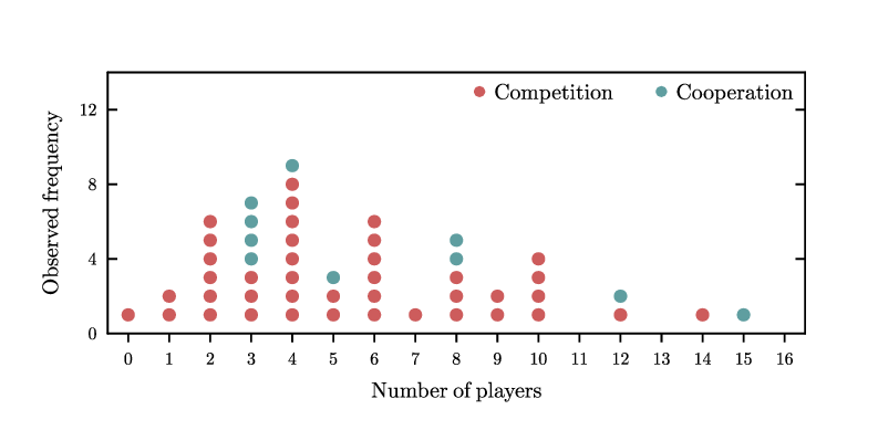
bindots.gle
 bindots.gle bindots.zip zip file contains all files for this figure.
! Example of dot plot.
! Author: Francois Tonneau

size 10 5

set font ss

include dotp.gle

amove 1.2 1.2
begin graph
    size 8 3
    fullsize

    ! The bindots.dat file contains two series of integers.

    data "bindots.dat"

    xaxis min -0.5 max 16.5 ftick 0 dticks 1
    yaxis min 0 max 14 ftick 0 dticks 4
    x2ticks  off
    subticks off
    xticks length -0.1
    labels hei 0.25
    xtitle "Number of players" dist 0.2
    ytitle "Observed frequency" dist 0.2

    ! We bin the d1 and d2 datasets into d3 and d4. The parameters for binning
    ! are chosen so that the bin midpoints will be the integers from 0 to 15.

    let d3 = hist d1 from -0.5 to 15.5 bins 16
    let d4 = hist d2 from -0.5 to 15.5 bins 16

    ! Because we want stacked dotplots, we must cumulate d3 and d4 before
    ! plotting d4 above ("from") d3.

    let d4 = d3+d4

    draw dotplot d3 indianred
    draw dotplot d4 cadetblue from d3
end graph

begin key
    pos tr hei 0.25 coldist 0.5 nobox
    marker fcircle color indianred msize 0.15 text Competition
    separator
    marker fcircle color cadetblue msize 0.15 text Cooperation
end key
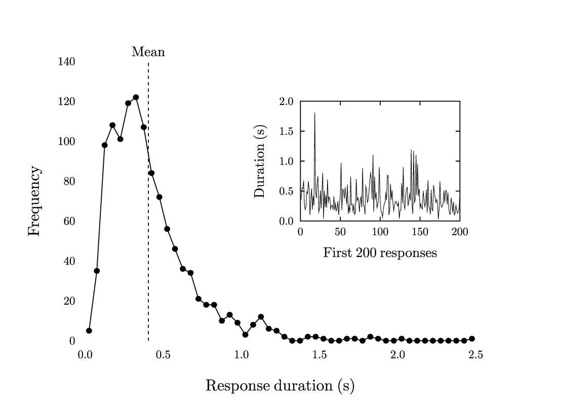
binning.gle
 binning.gle binning.zip zip file contains all files for this figure.
! Example of binning.
! Author: Francois Tonneau

size 14 10

set font ss

! The raw data in binning.dat are 1160 response durations by a Wistar rat
! pressing a lever.

begin graph
    data "binning.dat"
    x2axis off
    y2axis off
    side   off
    ticks  off
    labels dist 0.25
    xtitle "Response duration (s)" hei 0.4 dist 0.5
    ytitle "Frequency" hei 0.4 dist 0.4

    ! We use the 'hist' command with the 'bins' option to bin the d1 data into
    ! dataset d2, and we plot the results as a frequency polygon.

    ! *Note*: instead of specifying a number of bins with 'bins', we could have
    ! specified the size of each bin with the 'step' option. This alternative is
    ! less precise, however, and its use is not recommended.

    let d2 = hist d1 from 0 to 2.50 bins 50
    d2 line marker fcircle msize 0.18
end graph

include dsave.gle

! We save dataset d2 to the 'binning_results.txt' file, using 3 decimal places
! for the x values and 0 decimal places for the y values (dsave also accepts a
! string argument as header, see the dsave.gle library file for details).

dsave d2 binning_results.txt 3 0

include graphutil.gle

! We add plot decorations; 'dmeany' computes the mean of a dataset.

mean = dmeany(d1)

set lstyle 22 hei 0.35 just cc

graph_vline mean

amove xg(mean) yg(145)
write "Mean"

! We end by plotting the first 200 raw values in an inset graph.

amove 7.5 4.5
begin graph
    size 4 3
    fullsize
    subticks off
    xaxis min 0 max 200 dticks 50
    yaxis min 0 max 2 dticks 0.5
    xtitle "First 200 responses" dist 0.3
    ytitle "Duration (s)" dist 0.3
    data "binning.dat"
    let d2 = d1 from 1 to 200
    d2 line lwidth 0.01
end graph
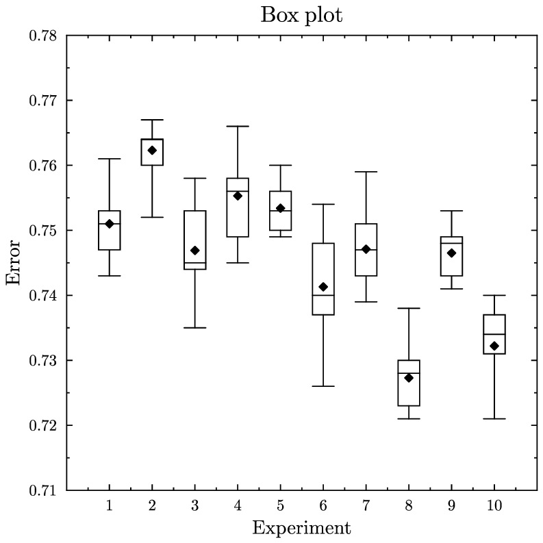
boxplot.gle
 boxplot.gle boxplot.zip zip file contains all files for this figure.
size 10 10

include "graphutil.gle"

set font texcmr
begin graph
   scale auto
   title "Box plot"
   xtitle "Experiment"
   ytitle "Error"
   data "boxplot.csv"
   xaxis min 0 max 11 ftick 1 dticks 1 nolast
   yaxis min 0.71 max 0.78
   draw boxplot bwidth 0.4
end graph
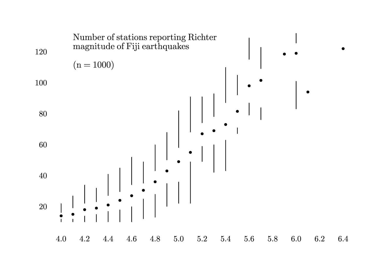
boxplot-ft.gle
 boxplot-ft.gle boxplot-ft.zip zip file contains all files for this figure.
! Boxplot in Tufte's style.
! Author: Francois Tonneau

size 18.5 13

! We plot the data points in a graph block.

amove 3 2
begin graph
    size 14 10
    fullsize
    xaxis min 4.0 max 6.4 dticks 0.2
    yaxis min 10 max 140 ftick 20 dticks 20 nolast
    side    off
    ticks   off
    xlabels dist 0.7 hei 0.5
    ylabels dist 0.7 hei 0.5
    data "boxplot.dat"
    d3 marker dot
end graph

! We now add boxplot whiskers.

set lwidth 0.03

total = ndata(d1)

for num = 1 to total
    x  = dataxvalue(d1, num)
    y1 = datayvalue(d1, num)
    y2 = datayvalue(d2, num)
    y4 = datayvalue(d4, num)
    y5 = datayvalue(d5, num)
    amove xg(x) yg(y1)
    aline xg(x) yg(y2)
    amove xg(x) yg(y4)
    aline xg(x) yg(y5)
next num

! We end with the plot description.

amove xg(4.1) yg(120)
set just cl hei 0.45
begin table
    Number of stations reporting Richter
    magnitude of Fiji earthquakes

    ({\it n} = 1000)
end table
bubble.gle
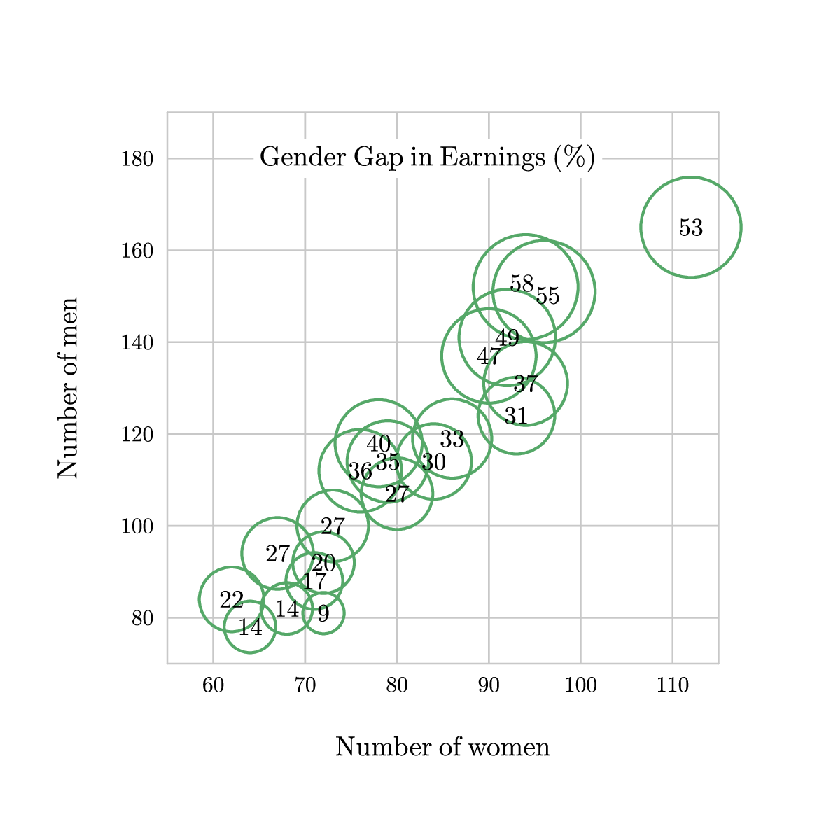 bubble.gle bubble.zip zip file contains all files for this figure.
! Demo about reading data from a file.
! Author: Francois Tonneau

size 15 15

set font ss hei 0.5

amove 3 3

! We will plot the percent salary gap between women and men as a function of
! the number of men and women per college. We begin by preparing the plot area
! -- no dataset is loaded:

begin graph
    size 10 10
    fullsize
    xaxis min 55 max 115 ftick 60 dticks 10
    yaxis min 70 max 190 ftick 80 dticks 20
    axis grid lwidth 0.03 color #c8c8c8
    labels color black
    xtitle "Number of women" dist 0.8
    ytitle "Number of men" dist 0.8
end graph

! We now use GLE's file-handling routines to draw a bubble plot. First, we open
! ('fopen') the bubbles.dat file in the 'read' mode, creating a handle that we
! call, 'stream' (without quotes; any other name would do). Then we run a loop
! to read data from the file until its end, feof(stream). In each step of the
! loop, we read the 'women', 'men', and 'gap' variables and we draw a circle
! in accordance with these values. The radius is a square root, so that the
! area inside the circle is a linear function of the salary gap.

scaling = 0.125

set color #55a868 just cc lwidth 0.05

fopen "bubble.dat" stream read

until feof(stream)
    fread stream women men gap
    amove xg(women) yg(men)
    radius = sqrt(gap)
    circle radius*scaling
next

fclose stream

! Now we add labels to the bubbles. This is done in a separate loop to have the
! circles behind the labels -- otherwise the former would obscure the latter.
! Note that the positions of two labels are adjusted to avoid label overlap.

adj = 0.07

set color black just cc hei 0.45

fopen "bubble.dat" stream read

until feof(stream)
    fread stream women men gap
    amove xg(women) yg(men)
    if gap = 55 then rmove  adj -adj
    if gap = 58 then rmove -adj  adj
    write gap
next

fclose stream

! We end with a short plot description:

set color black hei 0.5 just cl

amove xg(65) yg(180)

begin box add 0.1 fill white nobox
    write "Gender Gap in Earnings (%)"
end box

! Done. We have learned about file handling and 'until ... next' loops.
bumpchart.gle
 bumpchart.gle bumpchart.zip zip file contains all files for this figure.
! Example of bumpchart.
! Author: Francois Tonneau

size 16 13

include bumps.gle

set font ss hei 0.4 color gray70

set just cc
amove pagewidth()/2 pageheight()-1
write "Port ranks by volume, years 2004 to 2014"

! Colorize a few categories.

guangzhou$      = navy
ningbo_z_shan$  = navy
tianjin$        = navy

hamburg$        = darkred
los_angeles$    = darkred
long_beach$     = darkred

hong_kong$      = olivedrab
kaohsiung$      = olivedrab

! Define graph surface.

amove 4 2
begin graph
    size 8 9
    fullsize
    xaxis min 1 max 11 ftick 1 dticks 2
    yaxis min 1 max 15 negate
    side   off
    ticks  off
    labels off
    xlabels dist 0.5 hei 0.45
    xnames 2004 2006 2008 2010 2012 2014
end graph

! Draw bumpchart. The bumpchart subroutine is called outside of the graph block
! to avoid clipping on the edges.

bumpchart "ports.dat" 1.0 r  0.5 c  0.5 c  1.0 l &
          dotsize 0.1 dotstyle open linewidth 0.05 overwidth 0.12 textcolor gray70
clip-ft.gle
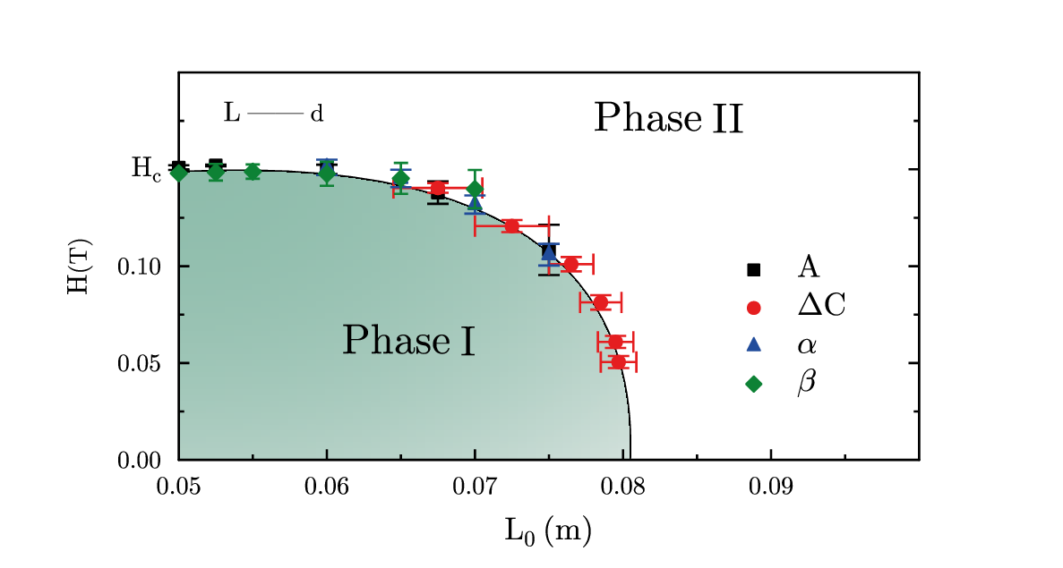 clip-ft.gle clip-ft.zip zip file contains all files for this figure.
! Example with a clipped color gradient.
! Author: Francois Tonneau

size 15 8

left  = 0.05
right = 0.0804
top   = 0.1480

reddish  = rgb255(229,  30,  32)
blueish  = rgb255( 33,  76, 155)
greenish = rgb255( 13, 130,  53)

set font ss lwidth 0.03

amove 2.5 1.5

! We plot the data as a series of scatter plots with error lines.

begin graph
    size 10.5 5.5
    fullsize
    xaxis min 0.05 max 0.10 dticks 0.01 nolast format "fix 2"
    yaxis min 0.00 max 0.20 dticks 0.05 nolast format "fix 2"
    ticks length 0.15
    x2ticks off
    labels hei 0.45 dist 0.25
    ynames "\sethei{0.35}0.00" 0.05 0.10 "\sethei{0.4}{\it H}_{c}"
    xtitle "{\it L_{0}} (m)" dist 0.30
    ytitle "\sethei{0.4}{\it H}\sethei{0.35}(T)" dist 0.35

    data "clip-ft.dat" &
        d1=c1,c2   d2=c1,c3 &
        d3=c4,c5   d4=c4,c6 &
        d5=c7,c8   d6=c7,c9 &
        d7=c10,c11 d8=c10,c12 &
        d9=c4,c13

    d1 marker fsquare   color black    msize 0.23
    d3 marker fcircle   color reddish  msize 0.25
    d5 marker ftriangle color blueish  msize 0.26
    d7 marker fdiamond  color greenish msize 0.32

    ! Most of the error lines are vertical ('err'), but we also add horizontal
    ! error lines ('herr') to dataset d3:

    d1 err  d2 errwidth  0.3 lwidth 0.03
    d3 err  d4 errwidth  0.3 lwidth 0.03
    d5 err  d6 errwidth  0.3 lwidth 0.03
    d7 err  d8 errwidth  0.2 lwidth 0.03

    d3 herr d9 herrwidth 0.3 lwidth 0.03

    ! Now we draw a colored gradient/region, using a low-rank layer to stay
    ! behind the data points and the axes:

    begin layer 300
        draw filled_region
    end layer

end graph

! In GLE, gradients/colormaps occupy a rectangular area, whereas we want our
! colored gradient to fill a curved contour. The solution is to use the contour
! as a boundary and clip the gradient after it. This involves four steps:
!
! 1. Begin a clipping block to save GLE's default clipping state, which will be
!    restored later.
!
! 2. Write a 'begin path ... end path' block with the 'clip' option on. Until
!    the end of the clipping block, anything drawn after the path will remain
!    clipped inside it.
!
! 3. Move to what will be the lower left corner of the gradient/colormap, and
!    draw the rectangular gradient. Because of step (2), the visible gradient
!    will stay inside the clipping path.
!
! 4. End the clipping block, restoring the default clipping state.

sub filled_region
    begin clip

        amove xg(left)  yg(0)

        set lwidth 0.06
        begin path clip stroke
            aline xg(right) yg(0)
            aline xg(left) yg(top) curve 88 3 1.4 6.1
            closepath
        end path

        amove xg(left) yg(0)

        ! As we know, a colormap associates to each point of a rectangle a
        ! number f that ranges from 0 to 1 and that depends on the (x, y)
        ! coordinates of this point. When used with the 'palette' option,
        ! the colormap command takes the following arguments:
        !
        ! "f(x,y)", a formal expression of x and y
        !
        ! x0 and x1, the initial and final values of x along the x-axis
        !
        ! y0 and y1, the initial and final values of y along the y-ayis
        !
        ! the number of steps for x and the number of steps for y
        !
        ! the width and height of the rectangle in cm
        !
        ! palette 'pal', where 'pal' refers to a subroutine that maps numbers
        ! in the 0-1 range to colors.

        ! In our example, we let x and y range from 0 to 1 in 50 steps each. Our
        ! "f(x,y)" expression is "z(x,y)", in reference to a 'z' subroutine we
        ! define below, and our palette is 'sky', also defined below. We add a
        ! small amount of padding to each side of the gradient rectangle to
        ! make sure that our region is well covered and that no whitespace
        ! shows through:

        local padding = 0.1

        local x0 = 0
        local x1 = 1
        local y0 = 0
        local y1 = 1
        local nx = 50
        local ny = 50
        local width  = xg(right) - xg(left) + padding
        local height = yg(top) - yg(0) + padding

        colormap "z(x,y)" x0 x1 y0 y1 nx ny width height palette sky

    end clip
end sub

! Here is the subroutine that assigns a value in the 0-1 range to each point of
! the gradient rectangle. (The name, 'z', is arbitrary; we could have chosen any
! other name, as long as we make reference to it in our colormap command.) The
! returned value is a linear function of the distance from (x, y) to the upper
! left corner of the rectangle, (0, 1):

sub z x y
    local  distance = (x - 0)^2 + (y - 1)^2
    local  maximum  = (1 - 0)^2 + (0 - 1)^2
    local  gain     = 0.7
    local  value    = gain * distance/maximum
    return value
end sub

! Finally, our 'sky' palette. A palette is a subroutine that takes a numeric
! argument as input and that returns a valid GLE color. The argument is assumed
! to be in the 0-1 range. In the case of our sky palette, the returned rgb255
! value is a linear mixture of two colors in standard RGB space:

sub sky z
    local r_cool = 143; local g_cool = 189; local b_cool = 172
    local r_warm = 240; local g_warm = 240; local b_warm = 240
    local r = z * r_warm + (1 - z) * r_cool
    local g = z * g_warm + (1 - z) * g_cool
    local b = z * b_warm + (1 - z) * b_cool
    return rgb255(r, g, b)
end sub

! We finish the figure by adding a legend and two labels:

begin key
    absolute 10.30 4.65 nobox just tl dist 0.5 hei 0.45
    marker fsquare   color black    msize 0.23 text "{\it A}"
    marker fcircle   color reddish  msize 0.25 text "\Delta {\it C}"
    marker ftriangle color blueish  msize 0.26 text \alpha
    marker fdiamond  color greenish msize 0.32 text \beta
end key

set hei 0.6
amove xg(0.078) yg(0.170)
write "Phase \raise{-0.06em}{II}"
amove xg(0.061) yg(0.055)
write "Phase \raise{-0.06em}I"

set hei 0.4
amove xg(0.053) yg(0.175)
write "{\it L} || \sethei{0.35}d"

! Done. We have learned about clipping and color gradients.
corrs.gle
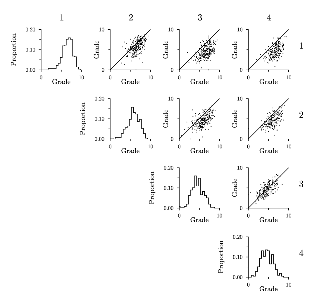 corrs.gle corrs.zip zip file contains all files for this figure.
! Example with multiple scatter plots.
! Author: Francois Tonneau

! Data and figure from Sokolowski and Tonneau: Perspectives on Behavior Science
! (2021) 44:621–640
! https://doi.org/10.1007/s40614-021-00321-y

size 14 13

set font ss hei 0.3

sub hist index
    gsave
    begin graph
        size 1.75 1.75
        fullsize
        xaxis min 0 max 10 ftick 0 dticks 10
        yaxis min 0 max 0.2 ftick 0 dticks 0.1 format "fix 2"
        x2axis off
        y2axis off
        xside off
        xtitle Grade adist 0.4
        ytitle Proportion adist 1.1
        labels hei 0.3
        ticks length -0.1
        subticks length -0.075
        data eval("hist_" + index + ".dat")
        d1 line hist
    end graph
    grestore
end sub

sub scatter index
    gsave
    begin graph
        size 1.75 1.75
        fullsize
        xaxis min 0 max 10 ftick 0 dticks 10
        yaxis min 0 max 10 ftick 0 dticks 10
        x2axis off
        y2axis off
        xtitle Grade adist 0.4
        ytitle Grade adist 0.5
        labels hei 0.3
        ticks length -0.1
        subticks length -0.075
        data wholeset.dat &
            d1=c1,c2 d2=c1,c3 d3=c1,c4 &
            d4=c2,c3 d5=c2,c4 &
            d6=c3,c4
        d[index] marker fcircle msize 0.02
        let d9 = intercept+(slope*x)
    end graph
    amove xg(0) yg(0)
    aline xg(10) yg(10)
    grestore
end sub

! Draw histograms along the diagonal.
amove 1.75 10
hist 1
rmove 3 -3
hist 2
rmove 3 -3
hist 3
rmove 3 -3
hist 4

! Draw first row of scatterplots.
amove 4.75 10
scatter 1
rmove 3 0
scatter 2
rmove 3 0
scatter 3

! Draw second row of scatterplots.
rmove -3 -3
scatter 4
rmove 3 0
scatter 5

! Draw scatterplot on third row.
rmove 0 -3
scatter 6

! Add column and row numbers.
set hei 0.4 just bc
amove 2.65 12.15
write 1
rmove 3 0
write 2
rmove 3 0
write 3
rmove 3 0
write 4
!
set just cl
rmove 1.3 -1.1
write 1
rmove 0 -3
write 2
rmove 0 -3
write 3
rmove 0 -3
write 4
data.gle
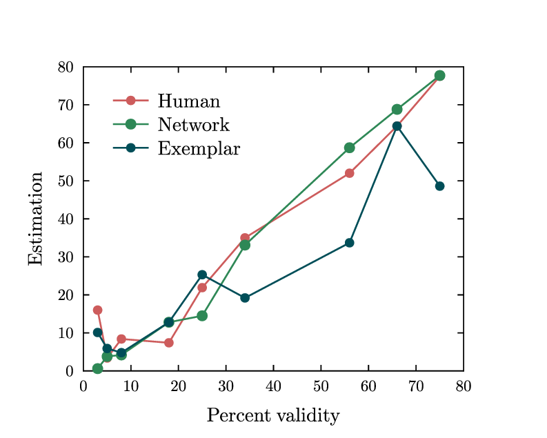 data.gle data.zip zip file contains all files for this figure.
! Demo about plotting data from a file.
! Author: Francois Tonneau

size 10 8

set font ss

! To plot data in GLE, we use a 'begin graph ... end graph' block. This block
! creates a plot area with customizable axes and titles. Additional commands
! in the graph block allow us to load datasets from a file and to customize
! the display of each dataset.

begin graph

    subticks off

    xtitle "Percent validity" dist 0.3
    ytitle "Estimation" dist 0.3

    ! The 'data' command loads datasets from a plain-text file, here the one
    ! called 'data.dat'. (You should have downloaded this file and copied it in
    ! your working directory, along with the present script.) In GLE, datasets
    ! are called d1, d2, d3, etc. Unless told otherwise with the di=cj,ck ...
    ! syntax, GLE will build dataset

    ! d1 out of file columns 1 and 2
    ! d2 out of file columns 1 and 3
    ! d3 out of file columns 1 and 4

    ! etc.

    ! Thus, in our example:

    data "data.dat"

    ! is shorthand for 'data data.dat d1=c1,c2 d2=c1,c3 d3=c1,c4'.

    ! We now plot each of the datasets, specifying line color and width, marker
    ! type (here, filled circle: 'fcircle'), and marker size ('msize'):

    d1 line color #cd5c5c lwidth 0.03 marker fcircle msize 0.20
    d2 line color #2e8856 lwidth 0.03 marker fcircle msize 0.24
    d3 line color #004e58 lwidth 0.03 marker fcircle msize 0.20

    ! The 'key' command inserts a legend in the plot. We place the legend at
    ! the top left ('tl') with offsets of 0.35 and 0.30 cm; 'compact' means
    ! that the markers and lines in the legend will be superimposed. Because
    ! the data.dat file has labels on its first row, these are recognized as
    ! such and inserted in the legend without further ado.

    key pos tl offset 0.35 0.30 compact nobox

end graph

! Done. We have learned about 'begin graph ... end graph' blocks, dataset
! loading, dataset plotting, and legend drawing.
f-f2.gle
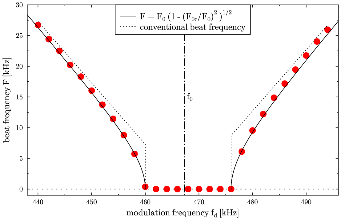 f-f2.gle f-f2.zip zip file contains all files for this figure.
size 14 9

include "graphutil.gle"

f0 = 467300.42; flock = 460000; frock = 476000

sub adler x f
   return abs(f0-x)*sqrt(1-((f-f0)/(x-f0))^2)
end sub

sub graph_hairlines
   set lstyle 6 just lc
   graph_vline f0
   graph_text f0 15000 label "f_0" dx 0.1
   set lstyle 4
   graph_hline 0
end sub

set font texcmr
begin graph
   scale  auto
   xtitle "modulation frequency f_d [kHz]"
   ytitle "beat frequency F [kHz]"
   data   "f-f2.dat"
   xaxis min 438000 max 496000
   yaxis min -1000  max 30000
   xnames 440 450 460 470 480 490
   ynames 0   5   10  15  20  25  30
   let d10 = adler(x,flock) to flock step 10
   let d11 = adler(x,frock) from frock step 10
   d7  marker fcircle msize 0.35 color red
   d6  line lstyle 2
   d10 line lstyle 1
   d11 line lstyle 1
   draw graph_hairlines
end graph

begin key
  pos tc
  line lstyle 1 text "F = F_0 (1 - (F_{0c}/F_0)^2 )^{1/2}"
  line lstyle 2 text "conventional beat frequency"
end key
filters81.gle
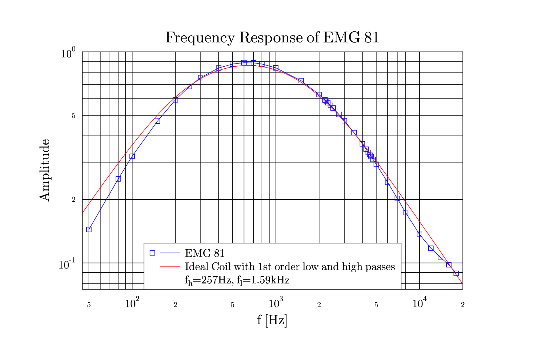 filters81.gle filters81.zip zip file contains all files for this figure.
size 24 15

! Highpass Data
Rh = 9.1e3; Ch = 68e-9

! Lowpass Data
Rl = 1e3; Cl = 100e-9

sub f x
   ! Frequency response with low impedance coil L <= 1 Henry
   ! 1st order Low- and Highpasses
   f1 = Rh/sqrt(1/(4*pi^2*x^2*Ch^2)+Rh^2)
   f2 = 1/sqrt(1+4*pi^2*x^2*Cl^2*Rl^2)
   return f1*f2
end sub

set font texcmr hei 0.6
begin graph
  title  "Frequency Response of EMG 81"
  xtitle "f [Hz]"
  ytitle "Amplitude"
  data   "emg81ndiv.dat"
  xaxis min 45    max 20000 grid log format "sci 0 10"
  yaxis min 0.075 max 1     grid log format "sci 0 10"
  let d13 = d3*8
  d13 marker square msize 0.3 line color blue
  let d33 = f(x) step 100
  d33 line color red
end graph

begin key
  pos bc hei 0.49
  marker square msize 0.3 line color blue text "EMG 81"
  line color red text "Ideal Coil with 1st order low and high passes"
  text "f_h=257Hz, f_l=1.59kHz"
end key
fitting.gle
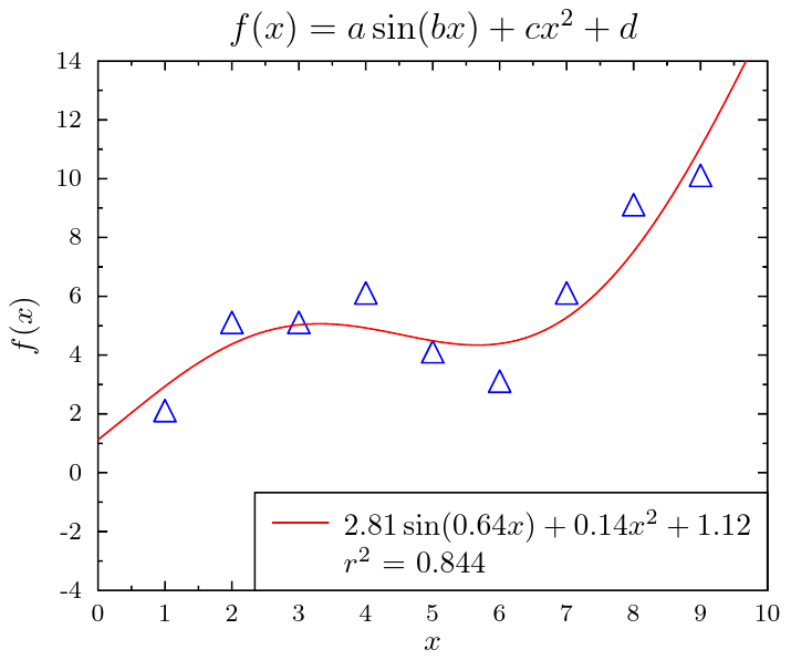 fitting.gle fitting.zip zip file contains all files for this figure.
!
! fittting - fitting data to an abitrary function
!
size 9 7.5
a = 0; b = 0; c = 0; d = 0; r = 0

! use latex in the graph labels
set texlabels 1

begin graph
   scale  auto
   xtitle "$x$"
   ytitle "$f(x)$"
   title  "$f(x) = a\sin(bx)+cx^2+d$"
   xaxis min 0  max 10
   yaxis min -4 max 14
   data   "fitting.dat"
   ! call the GLE fit function with the mathematical function to fit
   let d2 = fit d1 with a*sin(b*x)+c*x^2+d rsq r
   d1 marker triangle color blue
   d2 line color red
end graph
! print out the paramter values
fct$ = "$"+format$(a,"fix 2")+"\sin("+format$(b,"fix 2")+"x)+"+&
       format$(c,"fix 2")+"x^2+"+format$(d,"fix 2")+"$"

begin key
   pos br
   line color red text fct$
   text "$r^2$ = "+format$(r,"fix 3")
end key
frequency.gle
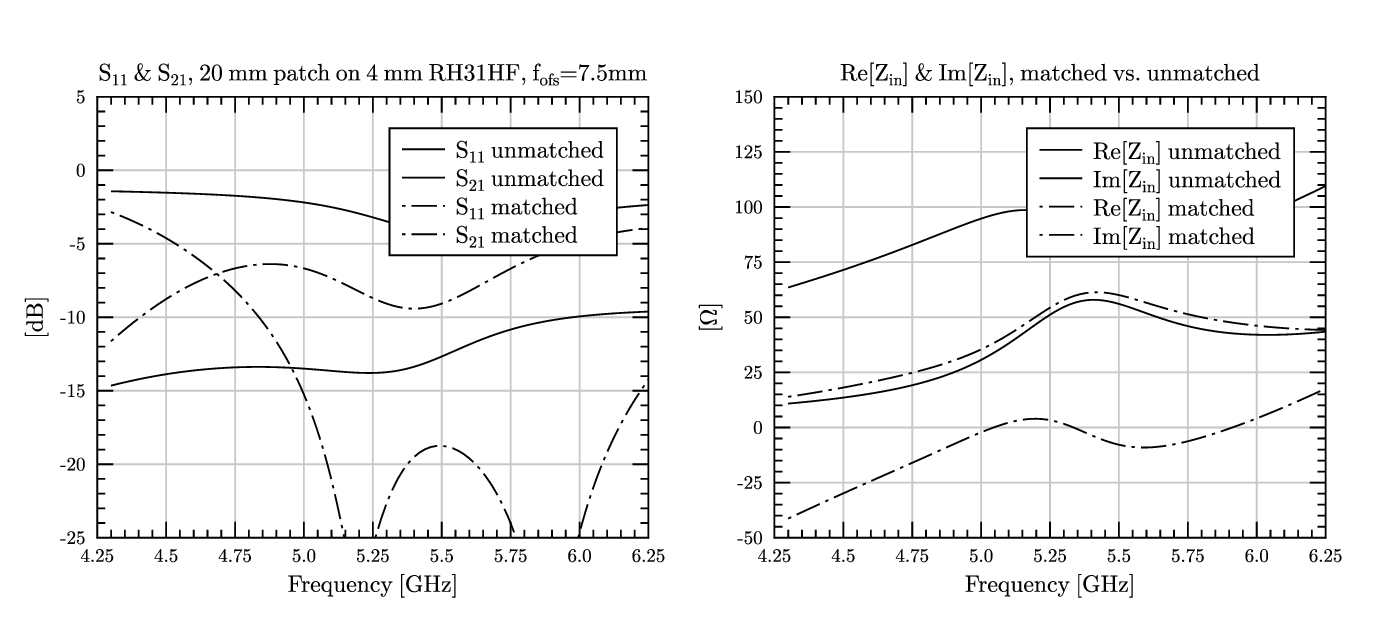 frequency.gle frequency.zip zip file contains all files for this figure.
! Some nice plots submitted by Johan Granholm <jg@emi.dtu.dk>

size 17.5 8
set font texcmr hei 0.3 titlescale 1

sub mygrid xtick ytick xsubtick ysubtick
   begin graph
      size 10 8
      xaxis min xgmin max xgmax dticks xtick dsubticks xsubtick
      yaxis min ygmin max ygmax dticks ytick dsubticks ysubtick
      ticks    length 0.2
      subticks length 0.1
      labels   off
   end graph
end sub

amove -.3 0 ! Left half...
begin graph
   size 10 8
   title  "S_{11} & S_{21}, 20 mm patch on 4 mm RH31HF, f_{ofs}=7.5mm"
   ytitle "[dB]"
   xtitle "Frequency [GHz]"
   side off
   ticks color gray10
   xaxis min 4.25 max 6.25 dticks 0.25 dsubticks 0.05 grid
   yaxis min -25  max 5    dticks 5    dsubticks 1    grid
   data "c20f75.out" ignore 4
   key position tr offset 0.4 0.4
   d3 lstyle 1 lwidth 0.02 key "S_{11} unmatched"
   d5 lstyle 1 lwidth 0.02 key "S_{21} unmatched"
   d1 lstyle 6 lwidth 0.02 key "S_{11} matched"
   d2 lstyle 6 lwidth 0.02 key "S_{21} matched"
end graph

mygrid xtick 0.25 ytick 5 xsubtick 0.05 ysubtick 1

amove 8.3 0 ! Right half...
begin graph
   size 10 8
   title  "Re[Z_{in}] & Im[Z_{in}], matched vs. unmatched"
   ytitle "[\Omega]"
   xtitle "Frequency [GHz]"
   side off
   ticks color gray10
   xaxis min 4.25 max 6.25 dticks 0.25 dsubticks 0.05 grid
   yaxis min -50  max 150  dticks 25   dsubticks 5    grid
   data "c20f75.out" ignore 4
   key position tr offset 0.4 0.4
   d6 lstyle 1 lwidth 0.02 key "Re[Z_{in}] unmatched"
   d7 lstyle 1 lwidth 0.02 key "Im[Z_{in}] unmatched"
   d8 lstyle 6 lwidth 0.02 key "Re[Z_{in}] matched"
   d9 lstyle 6 lwidth 0.02 key "Im[Z_{in}] matched"
end graph

mygrid xtick 0.25 ytick 25 xsubtick 0.05 ysubtick 5
gradient.gle
 gradient.gle gradient.zip zip file contains all files for this figure.
! Example with grayscale gradients.
! Author: Francois Tonneau

! This example emulates a classic chart by William Playfair, "The Price of the
! Quarter of Wheat & Wages of Labour by the Week."

size 20 11

set font texcmr

amove 1.5 2
begin graph
    size 16 7
    fullsize
    xaxis min 0 max 51 dticks 1 angle 45
    yaxis min 0 max 100 dticks 10
    y2axis on

    xticks  off
    yticks  off

    ylabels off
    y2labels on

    ! To emulate Playfair's chart, we need custom ticks and x labels:

    xplaces  0  3  5 &
             7  9 11 13 15 17 19 21 23 25 &
            27 29 31 33 35 37 39 41 43 45 &
            47 49 51

    xnames  1565 80 90 &
            1600 10 20 30 40 50 60 70 80 90 &
            1700 10 20 30 40 50 60 70 80 90 &
            1800 10 20 30

    ! We use a 'draw SUBROUTINE' command to draw a custom grid in a low-rank
    ! layer, behind the data and axes. (The 'custom_grid' subroutine is defined
    ! below.) The 'draw SUBROUTINE' command has two advantages over calling the
    ! subroutine directly: the output of the subroutine will be clipped to the
    ! plot area, and the subroutine is allowed to call functions such as xg()
    ! and yg(), which would be otherwise illegal in a graph block.

    begin layer 400
        draw custom_grid
    end layer

    data "gradient.dat" d1=c1,c2 d2=c3,c4 d3=c3,c5

    ! We now plot the wage data with Savitsky-Golay smoothing, and we fill the
    ! space below them with a semi-transparent hue:

    d1 svg_smooth line color #954347 lwidth 0.06

    fill x1,d1 color rgba255(169,188,186,150)

    ! Finally, we plot the price data through another subroutine call:

    draw shaded_bars

end graph

! Here is the subroutine called from the graph block with 'draw custom_grid'.
! Because of the 'draw' directive, xg() and yg() won't raise errors:

sub custom_grid
    set color #c4c4c4 lwidth 0.01
    for x = 0 to 51 step 1
        amove xg(x) yg(0)
        aline xg(x) yg(100)
    next x
    for y = 0 to 100 step 5
        amove xg(0)  yg(y)
        aline xg(51) yg(y)
    next y
    set color gray60 lwidth 0.02
    for x = 7 to 47 step 10
        amove xg(x) yg(0)
        aline xg(x) yg(100)
    next x
    for y = 10 to 90 step 10
        amove xg(0) yg(y)
        aline xg(51) yg(y)
    next y
end sub

! A colormap associates to each point of a rectangle a numerical value f that
! depends on the (x, y) coordinates of this point. When used in the grayscale
! mode, the numerical value is an intensity of gray from 0.0 (= black) to 1.0
! (= white), and the colormap command takes the following arguments:
!
! "f(x,y)", a formal expression of x and y
!
! x0 and x1, the initial and final values of x along the x-axis
!
! y0 and y1, the initial and final values of y along the y-ayis
!
! the number of steps for x and the number of steps for y
!
! the width and height of the rectangle in cm.

! Our subroutine for shaded bars involves looping over the data and drawing a
! series of colormaps. Although this could be done by re-reading the data file
! with 'fread', we prefer to employ the ndata(), dataxvalue(), and datayvalue()
! functions that let us access individual points in a dataset. In each step of
! the loop, we move to what will be the lower left corner of the shaded bar,
! and we draw the bar as a colormap.

sub shaded_bars
    for num = 1 to ndata(d2)
        local x      = dataxvalue(d2, num)
        local bottom = datayvalue(d2, num)
        local top    = datayvalue(d3, num)

        amove xg(x-0.50) yg(bottom)

        local x0 = 0
        local x1 = 0
        local y0 = 0
        local y1 = 1
        local x_steps = 1
        local y_steps = 200
        local width  = xg(x-0.50) - xg(x+0.50)
        local height = yg(top) - yg(bottom)

        ! Each colormap will be a gradient in the vertical direction only, so
        ! we set both x0 and x1 to an arbitrary value (e.g., 0) and we require
        ! only one step for x. Setting the f(x,y) expression equal to "1-y" and
        ! letting y vary from 0 to 1 in 200 steps produces a smooth shaded bar
        ! from white (1-0 = 1) to black (1-1 = 0):

        colormap "1-y" x0 x1 y0 y1 x_steps y_steps width height
    next num
end sub

! For the roof decorations, we use combinations of straight lines and Bezier
! curves. The following syntax:
!
! line x y curve a0 a1 d0 d1
!
! draws a Bezier curve from the current position to position (x, y) with two
! control points. The first control point is at angle a0 and distance d0 from
! the current position. The second control point is at angle a1 and distance
! d1 from (x, y). Angles are in degrees, counted counterclockwise from the x
! axis, with 90 degrees at noon.

set color black fill #fafae4 lwidth 0.02
begin path stroke
    amove xg(0)  9
    rline 0 0.35
    aline xg(7)  9 curve 0 130 1 0
    closepath
end path
begin path stroke
    amove xg(7)  9
    aline xg(27) 9 curve 30 150 1.3 1.3
    closepath
end path
begin path stroke
    amove xg(27) 9
    aline xg(47) 9 curve 30 150 1.3 1.3
    closepath
end path
begin path stroke
    amove xg(51) 9
    rline 0 0.35
    aline xg(47) 9 curve 180 0 0.5 0
    closepath
end path

set font texcmti hei 0.25 just cc

! We add labels to two roof decorations:

amove xg(17) yg(103)
write "17^{th} century"
amove xg(37) yg(103)
write "18^{th} century"

! We end with more labels on the chart:

down = -0.34

set just tc
begin box add 0.15 fill white
    amove xg(22) yg(95.5)
    set font texcmb hei 0.3
    write "CHART"
    set font texcmti hei 0.3
    rmove 0 down
    write "Showing at One View"
    rmove 0 down
    write "The Price of the Quarter of Wheat"
    rmove 0 down
    write "& Wages of Labour by the Week."
    set hei 0.25
    rmove 0 down
    write "- from -"
    rmove 0 down
    write "The Year 1565 to 1821"
    rmove 0 down
    set font texcmr hei 0.25
    write "- by -"
    rmove 0 down
    write "WILLIAM PLAYFAIR"
end box

begin box add 0.05 nobox fill white
    set font texcmti hei 0.3 just cl
    amove xg(4) yg(10)
    write "Weekly Wages of a Good Mechanic"
end box

set just cc
amove xg(55) yg(50)
begin rotate -90
    write "Price of the Quarter of Wheat in Shillings"
end rotate

! Done. We have learned about the 'draw subroutine' graph command, grayscale
! colormaps, and Bezier curves.
hubble.gle
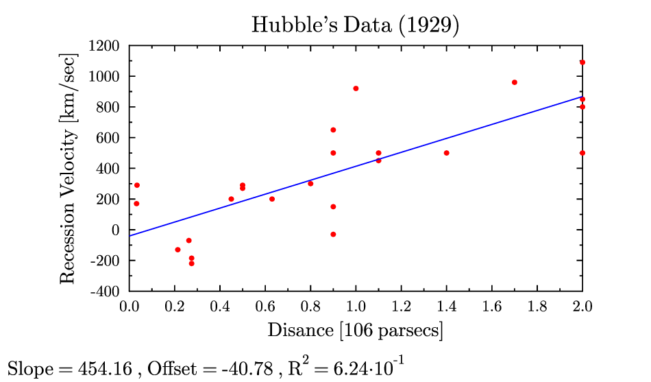 hubble.gle hubble.zip zip file contains all files for this figure.
!
! -- plot of Hubble's data to demonstrate GLE's fitting routines
!
size 12 7
set font texcmr
amove 0 0.5
begin graph
   size 12 6.5
   scale auto
   title  "Hubble's Data (1929)"
   xtitle "Disance [106 parsecs]"
   ytitle "Recession Velocity [km/sec]"
   data   "hubble.dat" d1=c3,c4 ignore 1
   d1 marker fcircle msize 0.11 color red
   let d2 = linfit d1 slope ofset rsquared
   d2 line color blue
end graph

amove 0.1 0.1
write "slope = " format$(slope,"fix 2") ", offset = " format$(ofset,"fix 2") ",  R^2 = " format$(rsquared,"fix 4")
jitter.gle
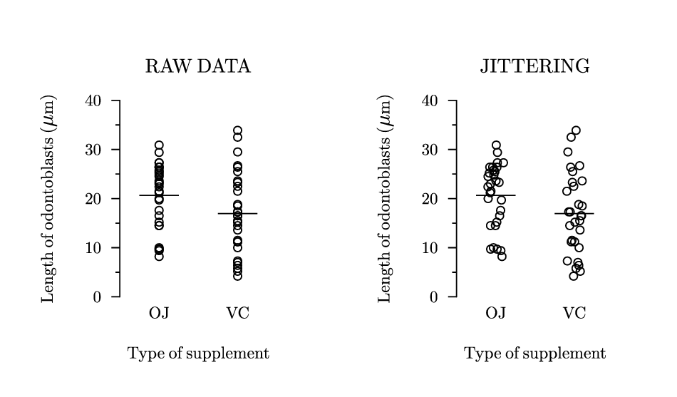 jitter.gle jitter.zip zip file contains all files for this figure.
! Example with jittering.
! Author: Francois Tonneau

! This example shows how the 'let dn = ...' command can be combined with the
! rnd() function to add jittering to data.

size 12 7

set font ss

marker_size = 0.2

sub jitter amount
    return rnd(amount)-amount/2                 ! => centered, uniform noise
end sub

sub plot_panel title$ mode$
    begin graph
        size 4 5
        title title$ hei 0.35 dist 0.5
        xaxis min 0.5 max 2.5 ftick 1 dticks 1
        xside off
        xticks off
        xtitle "Type of supplement" hei 0.3 dist 0.5
        xnames "OJ" "VC"
        x2axis off
        yaxis min 0 max 40 ftick 0 dticks 10
        yticks length -0.15
        ytitle "Length of odontoblasts (\sethei{.37}\mu \sethei{.3}m)" &
            hei 0.3 dist 0.5
        y2axis off
        data "jitter.dat" d1=c1,c2 d2=c3,c4
        if (mode$ = "jitter") then
            !
            ! Here we use horizontal jittering. To add vertical jittering (not
            ! recommended in this case), one might write:
            !
            ! let d1 = x+jitter(0.2), d1+jitter(10)
            ! let d2 = x+jitter(0.2), d2+jitter(10)
            !
            let d1 = x+jitter(0.2), d1
            let d2 = x+jitter(0.2), d2
        end if
        d1 marker circle msize marker_size
        d2 marker circle msize marker_size
    end graph
end sub

sub add_means
    amove xg(0.75) yg(20.66)
    aline xg(1.25) yg(20.66)
    !
    amove xg(1.75) yg(16.96)
    aline xg(2.25) yg(16.96)
end sub

! panel without jittering

amove 1.5 1
plot_panel "RAW DATA" "raw"
add_means

! panel with jittering

amove 7.5 1

plot_panel "JITTERING" "jitter"
add_means
labeled-scatter.gle
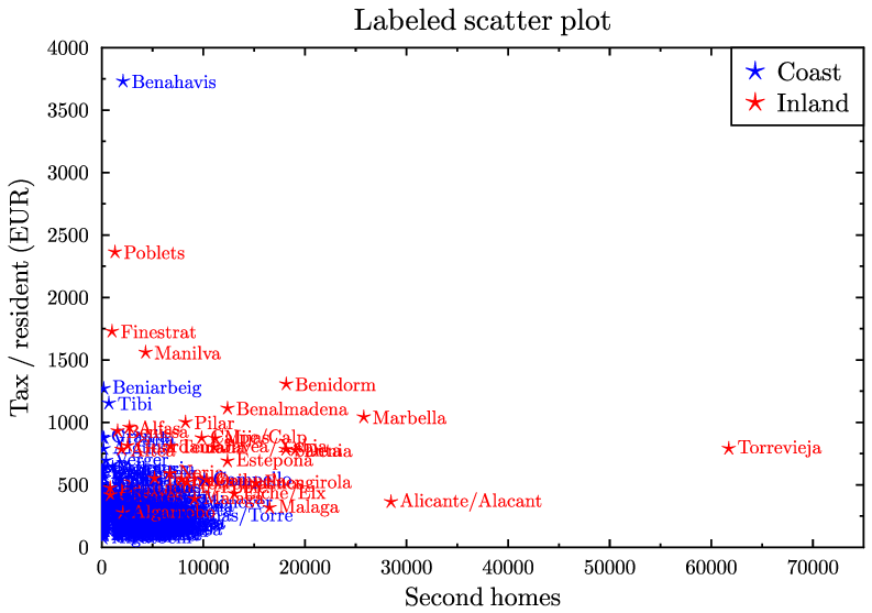 labeled-scatter.gle labeled-scatter.zip zip file contains all files for this figure.
size 10 7

! This example has been kindly provided by Emilio Torres Manzanera

set font texcmr hei 0.3

begin graph
   scale auto
   yaxis min 0 max 4000
   xaxis min 0 max 75000
   title  "Labeled scatter plot"
   xtitle "Second homes"
   ytitle "Tax / resident (EUR)"
   draw labeled_scatter "labeled-scatter.dat"
end graph

begin key
   pos tr
   marker star color blue text "Coast"
   marker star color red  text "Inland"
end key

! Open file and read it line by line.
! For each line, plot a labeled marker.

! Supporse that "labeled-scatter.dat" contains:
! "Sierra"    1  164.6  2
! "Relleu"    1  376.8  2
! "Salinas"   2  418.1  2
! "Almargen"  3  182.5  2
! "Moclinejo" 3  235.0  2

sub labeled_scatter file$
   set just lc hei 0.22
   fopen file$ f1 read
   until feof(f1)
      fread f1 txt$ x y t
      amove xg(x) yg(y)
      if t = 1 then set color red
      else set color blue
      marker star
      rmove 0.1 0
      write txt$
   next
   fclose f1
end sub
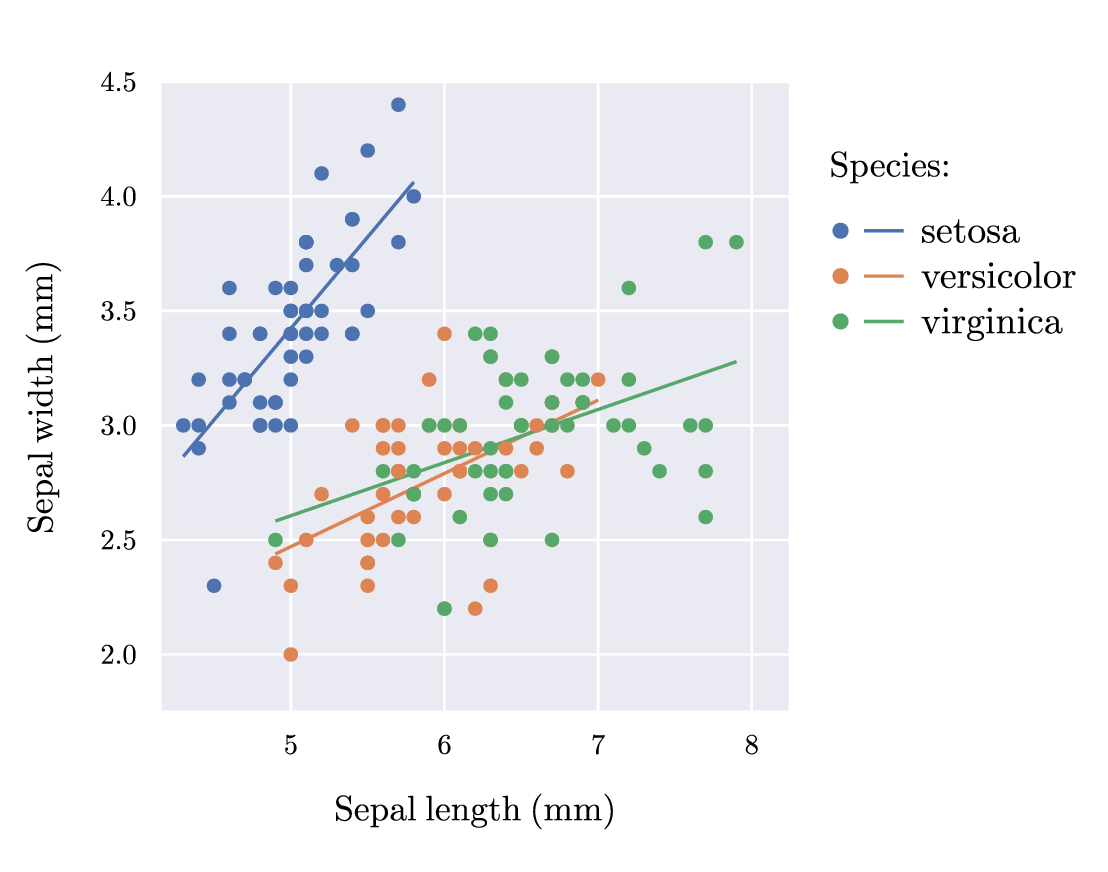
legend.gle
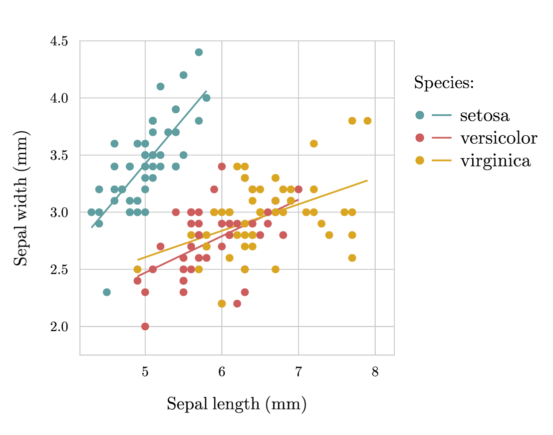 legend.gle legend.zip zip file contains all files for this figure.
! Example with custom legend.
! Author: Francois Tonneau

size 14 11

set font ss

amove 2 2
begin graph
    size 8 8
    fullsize
    xaxis min 4.15 max 8.25 dticks 1
    yaxis min 1.75 max 4.50 dticks 0.5

    ! The axis subcommand, 'grid', converts axis ticks into gridlines. The
    ! 'labels' command deals with the tick labels of all axes.

    axis grid color #c8c8c8
    labels color black dist 0.3 hei 0.45

    xtitle "Sepal length (mm)" dist 0.5
    ytitle "Sepal width (mm)" dist 0.5

    data "legend.dat" d1=c1,c2 d2=c3,c4 d3=c5,c6

    d1 color cadetblue marker fcircle msize 0.25
    d2 color indianred marker fcircle msize 0.25
    d3 color goldenrod marker fcircle msize 0.25

    ! We define new datasets from the linear fit of existing datasets, and we
    ! plot the results in a low-rank layer to have them behind the actual data
    ! points:

    let d4 = linfit d1 from 4.3 to 5.8
    let d6 = linfit d3 from 4.9 to 7.9
    let d5 = linfit d2 from 4.9 to 7.0

    begin layer 300
        d4 color cadetblue line lwidth 0.04
        d5 color indianred line lwidth 0.04
        d6 color goldenrod line lwidth 0.04
    end layer
end graph

set hei 0.45
amove 10.50 8.80
write "Species:"

! In GLE, different 'set' commands can be combined in a single line. Here we
! combine font-height and line-width settings:

set hei 0.48 lwidth 0.05

! We now use a 'begin key ... end key' block to build our plot legend. The first
! line in the block is our global key command. It puts the key (i.e., legend) at
! an absolute location in the figure, prevents GLE from drawing a box around the
! key ('nobox'), and defines line length for all entries ('llen 0.5'). The last
! three commands define a separate key entry with a line, marker, and text. The
! line and marker in each entry will not be superimposed because our global key
! command does not include the 'compact' option (see what happens when you add
! 'compact' after 'llen 0.5').

begin key
    absolute 10.30 6.55 nobox llen 0.5

    ! Another trick: The ampersand (&) can be used anywhere in a GLE script to
    ! continue a long command on the next line. Also note that we use the {\it
    ! ...} formatting macro to set text in italics.

    line lwidth 0.04 color cadetblue marker fcircle msize 0.25 &
        text "{\it setosa}"
    line lwidth 0.04 color indianred marker fcircle msize 0.25 &
        text "{\it versicolor}"
    line lwidth 0.04 color goldenrod marker fcircle msize 0.25 &
        text "{\it virginica}"
end key

! Done. We have learned about 'begin key ... end key' blocks and about linear
! fitting.
margins.gle
 margins.gle margins.zip zip file contains all files for this figure.
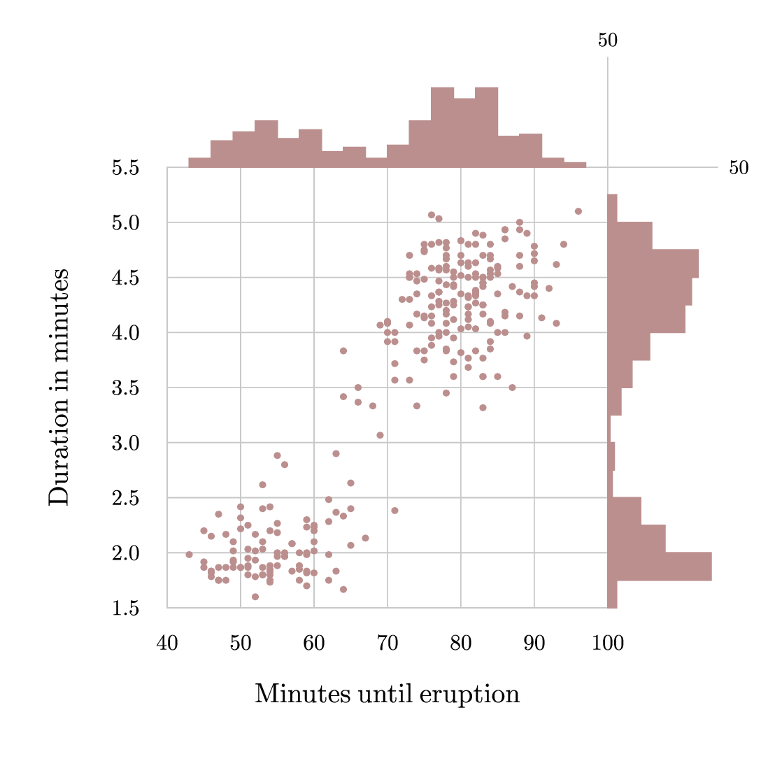
! Example with marginal histograms.
! Author: Francois Tonneau

size 14 14

set  font ss

amove 3 3

! Main plot.

begin graph
    size 8 8
    fullsize
    axis grid color gray10
    labels dist 0.5 color black hei 0.5
    xtitle "Minutes until eruption" hei 0.5 dist 0.60
    ytitle "Duration in minutes" hei 0.5 dist 0.80
    data "margins.dat"
    d1 marker fcircle color rosybrown msize 0.15
end graph

! We add two marginal plots. The data in each plot are obtained with 'hist'.

amove 3 11
begin graph
    size 8 2
    fullsize
    yaxis min 0 max 50
    axis off
    data "margins.dat" d1=c1,c1
    let d2 = hist d1 from 40 to 100 bins 20
    bar d2 width 3 color rosybrown fill rosybrown
end graph

amove 11 3
begin graph
    size 2 8
    fullsize
    xaxis min 0 max 50 dticks 50
    axis off
    data "margins.dat" d1=c2,c2
    let d2 = hist d1 from 1.5 to 5.5 bins 16
    bar d2 horiz width 0.25 color rosybrown fill rosybrown
end graph

! We conclude with marginal axis decorations.

amove 11 11
begin origin
    set color gray10
    aline 0 2
    amove 0 0
    aline 2 0
    set color black
    rmove 0.2 0
    set just lc
    write 50
    amove 0 2.2
    set just bc
    write 50
end origin
markers.gle
 markers.gle markers.zip zip file contains all files for this figure.
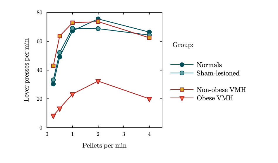
! Example with custom markers.
! Author: Francois Tonneau

size 12 7

set font ss join round lwidth 0.03 hei 0.30

! We define a scaling factor to make the size of custom markers comparable to
! the standard size, which is about equal to character height (0.7 times 1).

custom_marker_scaling = 0.7

! GLE lets us define markers in terms of custom subroutines that accept two
! parameters. When called with the 'msize' option, the first parameter will
! determine marker size. When called with the 'mdata dk' option, the second
! parameter will determine a marker property of our choice (say, a rotation
! angle) based on the values from dataset dk. Inside the subroutine, we put
! graphical commands to draw the marker we want.

! Here we define three subroutines to draw custom markers. We employ only one
! parameter (the one related to marker size), but we need to declare two, so
! we put 'datum' as an empty placeholder (any other name would do). The color
! drawn in each subroutine is that of the marker fill; edge color will be
! determined at run time by the line color used when plotting a dataset.

sub draw_blue_circle weight datum
    local radius = custom_marker_scaling * weight/2
    circle radius fill cadetblue
end sub

sub draw_beige_square weight datum
    local width = custom_marker_scaling * weight
    box width width justify cc fill goldenrod
end sub

sub draw_red_triangle weight datum
    local width = custom_marker_scaling * weight
    rmove -width/2 width/3
    begin path stroke fill tomato
        rline  width    0
        rline -width/2 -width
        closepath
    end path
end sub

! We define markers in terms of our subroutines:

define marker blue_circle  draw_blue_circle
define marker beige_square draw_beige_square
define marker red_triangle draw_red_triangle

! These markers can now be used to plot data:

amove 2 1.5
begin graph
    size 5 5
    fullsize
    xaxis min 0 max 4.5 ftick 0 dticks 1
    yaxis min 0 max 80 ftick 0 dticks 20
    subticks off
    side lwidth 0.02
    labels dist 0.2
    xtitle "Pellets per min" dist 0.3 color black
    ytitle "Lever presses per min" dist 0.3 color black

    data "markers.dat"

    d1 line color #004e58 marker fcircle      msize 0.25
    d2 line color #004e58 marker blue_circle  msize 0.25
    d3 line color brown   marker beige_square msize 0.22
    d4 line color brown   marker red_triangle msize 0.28
end graph

! We end with the legend, using an empty text as fake row to provide vertical
! spacing -- another useful trick.

amove 7.45 5.0
write "Group:"

begin key
    absolute 7.2 2.5 nobox compact llen 1.0
    line color #004e58 marker fcircle      msize 0.25 text "Normals"
    line color #004e58 marker blue_circle  msize 0.25 text "Sham-lesioned"
    text
    line color brown   marker beige_square msize 0.22 text "Non-obese VMH"
    line color brown   marker red_triangle msize 0.28 text "Obese VMH"
end key

! Done. We have learned how to define markers in terms of subroutines.
mutation.gle
 mutation.gle mutation.zip zip file contains all files for this figure.
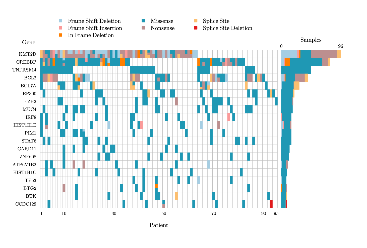
! Example of mutation plot.
! Author: Francois Tonneau

size 18.5 12.5

include muta.gle

set font ss

! Before drawing a mutation plot, we must specify a color for each type of
! mutation. Each color should be a string variable of the form:

! MUTATIONTYPE$

! where MUTATIONTYPE appears (without the final '$') in the datafile for the
! plot. Each line of the datafile should read as:

! row, column, mutation count, mutation types (with underscores, no spaces).

! For example:

! 13 37 2 nonsense missense
! 14 59 3 nonsense missense splice_site
! 28 97 1 nonsense

! See the accompaying datafile, mutation.dat, for an example of datafile in the
! correct format.

missense$        = "#1f98b4"  ! blue
nonsense$        = "#bc8f8f"  ! rosy brown
frame_shift_del$ = "#a6cee3"  ! pale blue
frame_shift_ins$ = "#fb9a99"  ! pale magenta
in_frame_del$    = "#ff7f00"  ! orange
splice_site$     = "#fdbf6f"  ! page orange
splice_site_del$ = "#e31a1c"  ! red

! We prepare the plot area with a begin graph ... end graph block. The axes
! range from 0.5 to 95.5 and from 0.5 to 20.5 because we want a mutation plot
! with 95 patients (columns) and 20 genes (rows). Also, we invert the y axis
! ('negate') to draw the plot from top to bottom.

amove 2 2
begin graph
    size 12 8
    fullsize

    xaxis min 0.5 max 95.5 ftick 1 dticks 1
    yaxis min 0.5 max 20.5 ftick 1 dticks 1
    yaxis negate

    lightgray$ = "#c0c0c0"
    side color lightgray$ lwidth 0.01
    ticks off

    xplaces 1 10 30 50 70 90 95
    xtitle Patient hei 0.30 dist 0.4
    ynames KMT2D      CREBBP    TNFRSF14   BCL2    BCL7A    &
           EP300      EZH2      MUC4       IRF8    HIST1H1E &
           PIM1       STAT6     CARD11     ZNF608  ATP6V1B2 &
           HIST1H1C   TP53      BTG2       BTK     CCDC129  &
           GNA13      HIST1H1D  HVCN1      MEF2B   LRRN3    &
           POU2AF1    POU2F2    HIST1H3G   HNRNPU  TPTE2    &
           CD79B      HIST1H1B  HIST1H2AM  VMA21   CXCR4    &
           HIST1H2BK  DEFB115   DUXA       HIST2H2AC
    labels color black hei 0.3 dist 0.2

end graph

! We draw the grid and the plot outside of the graph block to avoid clipping
! by axis boundaries. The grid is drawn first so that it does not obscure the
! plot. Cell borders are drawn in the pseudo-color, 'cell', to make the cells
! appear borderless. See the 'muta.gle' library file for more information.

mutagrid lightgray$ 0.01
mutaplot "mutation.dat" cell

! We add annotations and a plot legend.

set hei 0.30
amove xg(-1.5) yg(-0.5)
set just cr
write Gene

begin key
    pos tl offset 0.8 -0.5 dist 0.3 nobox
    hei 0.3
    coldist 1
    marker fsquare msize 0.2 color frame_shift_del$  text "Frame Shift Deletion"
    marker fsquare msize 0.2 color frame_shift_ins$  text "Frame Shift Insertion"
    marker fsquare msize 0.2 color in_frame_del$     text "In Frame Deletion"
    separator
    marker fsquare msize 0.2 color missense$         text "Missense"
    marker fsquare msize 0.2 color nonsense$         text "Nonsense"
    separator
    marker fsquare msize 0.2 color splice_site$      text "Splice Site"
    marker fsquare msize 0.2 color splice_site_del$  text "Splice Site Deletion"
end key

! We end with a horizontal bar chart on the right of the mutation plot.

hue_1$ = frame_shift_del$
hue_2$ = frame_shift_ins$
hue_3$ = in_frame_del$
hue_4$ = missense$
hue_5$ = nonsense$
hue_6$ = splice_site$
hue_7$ = splice_site_del$

amove 14.2 2.0

sum_first_row = 96

begin graph
    size 3 8
    fullsize
    xaxis min 0 max sum_first_row dticks sum_first_row
    yaxis min 0.5 max 20.5
    yaxis negate
    side   off
    ticks  off
    labels off
    data "mutationsums.dat"
    for num = 2 to 7
        let d[num] = d[num-1]+d[num]
    next num
    set lwidth 0.01
    bar d1 horiz width 1.0 color hue_1$ fill hue_1$
    for num = 2 to 7
        hue$= eval("hue_" + num + "$")
        bar d[num] from d[num-1] horiz width 1.0 color hue$ fill hue$
    next num
end graph

set hei 0.25 just cc
amove xg(0) yg(0)
write 0
amove xg(sum_first_row) yg(0)
write sum_first_row

amove xg(sum_first_row/2) yg(-0.75)
set hei 0.3 just cc
write Samples
objects.gle
 objects.gle objects.zip zip file contains all files for this figure.
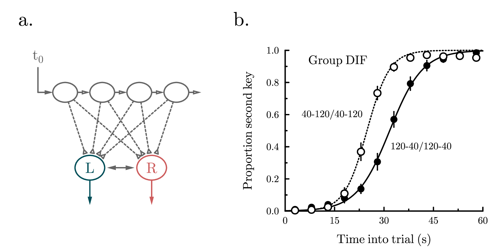
! Demo about graphical objects.
! Author: Francois Tonneau

size 20 10

! ==========

! Our figure has two panels. We start with panel (a).

set font ss hei 0.80 color black just bl
amove 0.7 9.0
write "a."

! This panel depicts a psychological model of timing called LeT (Machado A 1997
! Psychol Rev 104:241-265). We will draw a simplified diagram of the model with
! four connected nodes and two possible decisions, 'left' versus 'right'.

! We start our figure in basic GLE, no graphical objects involved:

set lwidth 0.05 color gray50 cap round

set font ss hei 0.6 just bc

amove 1.5  7.5
write "t{_0}"
rmove 0   -0.2
rline 0   -1
rline 0.6  0 arrow end

! Next we use diagram facilities. A first facility is the 'begin object ... end
! object' definition block. Here we define an object that we call, 'node', and
! that consists of an ellipse. The object is a generic one -- no drawing is
! done at this stage:

begin object node
    ellipse 0.5 0.4
end object

! Now we use a loop and the 'draw' commmand to draw our node object four times.
! Each node is left-center justified ('node.lc') and is assigned a unique name
! by combining the "node_" prefix with the loop index (we could have used any
! other names). String concatenation with '+' automatically converts numbers
! to strings:

for num = 1 to 4
    draw node.lc name "node_"+num
    rmove 1.5 0
next num

! The last command in the loop ('rmove 1.5 0') moved us to the right of the
! fourth node. We use the 'save' command to assign the name, 'border', to this
! position (again, we could have used any other name):

save border

! Now we join named objects/positions with single arrows ('->'). We could have
! used double arrows ('<->') or plain line segments ('-') instead:

set arrowstyle empty

join node_1 -> node_2
join node_2 -> node_3
join node_3 -> node_4
join node_4 -> border

! To complete our diagram we need to define another generic object, 'decision',
! made of a labeled ellipse and an arrow. Aside from objects and positions, GLE
! lets us name any rectangular region we are drawing with a 'begin name ... end
! name' construct. This construct can also be used within an object definition
! to identify a *part* of the object.

! Here we use this technique to identify a 'ring' part of 'decision' which puts
! a padding of 0.1 cm ('add 0.1') around the visible ellipse. Our definition of
! 'decision' involves two parameters, 'hue$' and 'label$':

begin object decision hue$ label$
    begin name ring add 0.1
        set lwidth 0.05 color hue$
        ellipse 0.6 0.5
        set just cc
        write label$
    end name
    rmove 0 -0.5
    set arrowstyle filled
    rline 0 -1.0 arrow end
end object

! We now draw two 'decision' objects, one in blue and one in red. Each object
! is center-center justified ('decision.cc') and is drawn with suitable values
! of the hue$ and label$ parameters:

amove 3.6 2.8
draw decision.cc name left  hue "#004e58" label "L"
rmove 2.5 0
draw decision.cc name right hue "#cd5c5c" label "R"

! GLE lets us define our own arrow styles with subroutines of the form:

! arrow_XXX param_1 param_2 param_3

! Here 'param_1' is the angle in degrees (counted counterclockwise from the x
! axis) of the line to which the arrow is attached; 'param_2' and 'param_3' are
! the values of the 'arrowangle' and 'arrowsize' settings, as determined at run
! time by the 'set arrowangle ...' and 'set arrowsize ...' commands. The newly
! defined arrow style, XXX, is invoked with the 'set arrowstyle XXX' command.

! In this example, we will create an arrow style that looks like a small fan.
! Our arrow_fan subroutine will make no use of the 'arrowangle' setting (which
! would determine the opening angle of the arrow tips), but we still need to
! declare three parameters, so we put 'constant' as a placeholder (any other
! name would do):

sub arrow_fan lineangle constant fansize
    set join round
    begin rotate lineangle-90
        begin path stroke fill white
            rline -fansize/2  0
            rline  fansize/2  fansize
            rline  fansize/2 -fansize
            closepath
        end path
    end rotate
end sub

! We now use a loop and our 'fan' arrow style to connect all nodes to the rings
! inside the 'left' and 'right' decisions, 'left.ring' and 'right.ring'. We use
! the circular/elliptic joining mode ('.c') to have the arrows reach elliptic
! boundaries instead of stopping at the enclosing rectangles:

set color gray50 lstyle 22 arrowstyle fan arrowsize 0.25

for num = 1 to 4
    join "node_"+num+".c" -> left.ring.c
    join "node_"+num+".c" -> right.ring.c
next num

! Finally, we connect the two rings with a standard double arrow ('<->'), again
! using the circular/elliptic joining mode ('.c'):

set lstyle 1 arrowstyle filled arrowsize 0.35 arrowangle 15

join left.ring.c <-> right.ring.c

! ==========

! Now we turn to panel (b), which reproduces a part of Fig. 16 in Machado A,
! Guilhardi P 2000 J Exp Anal Behav 74:25-54.

set font ss hei 0.80 color black just bl
amove 9.4 9.0
write "b."

set color black hei 0.5

! We define a subroutine for curve fitting. Note that GlE allows us to declare
! local variables inside a subroutine:

sub sigmoid x a b
    local  value = 1/(1 + exp(-(x - a)/b))
    return value
end sub

amove 11.5 1.5
begin graph
    size 8 6.5
    fullsize
    xaxis min 0 max 60 dticks 15
    yaxis min 0 max 1 dticks 0.2 format "fix 1"
    x2axis off
    y2axis off
    xtitle "Time into trial (s)" dist 0.4
    ytitle "Proportion second key" dist 0.5

    data "objects.dat"

    d1 marker fcircle msize 0.33
    d1 err d2 errwidth 0.001
    d3 marker wcircle msize 0.40
    d3 err d4 errwidth 0.001

    ! GLE has basic facilities for curve fitting. The 'let dn = fit dm ...'
    ! fills a dataset dn with the best fit of an x-expression to dataset dm.
    ! As usual, spaces are not allowed in the x-expression. The parameters to
    ! be fitted ('a' and 'b', in our example) should preferably be set to 0
    ! before calling the 'fit' command.

    ! *Note*: GLE's fitting facilities are limited, and best suited for informal
    ! data exploration. For more exact results, the use of a program specialized
    ! in nonlinear fitting is recommended.

    a = 0
    b = 0
    let d5 = fit d1 with sigmoid(x,a,b)
    let d6 = fit d3 with sigmoid(x,a,b)

    begin layer 300
        d5 line
        d6 line lstyle 12
    end layer
end graph

! Finally, we add labels to the plot area:

set just bl hei 0.50
amove xg(7) yg(0.9)
write "Group DIF"

set just cl hei 0.40
amove xg(5) yg(0.6)
write "40-120/40-120"
amove xg(32) yg(0.4)
write "120-40/120-40"

! ==========

! Done. We have learned about diagram facilities (including named objects and
! the 'join' command) and custom arrow styles.
opening.gle
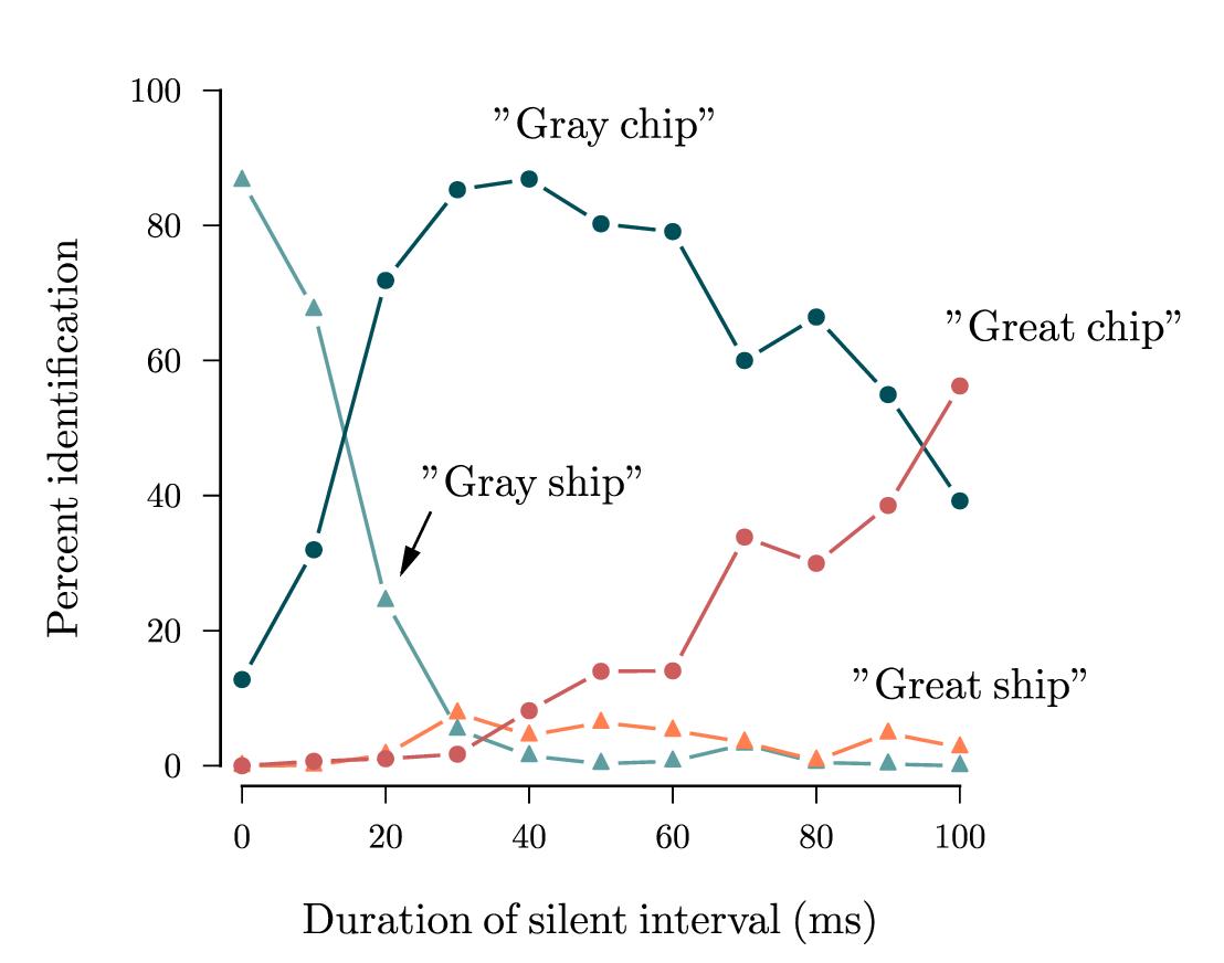 opening.gle opening.zip zip file contains all files for this figure.
! Demo with the openline subroutine.
! Author: Francois Tonneau

! This script uses a subroutine defined in another file, openline.gle. ***The
! script won't compile unless the openline.gle file is present, either in the
! same folder or in GLE's folder for custom libraries.*** The latter location
! is defined by the environment variable:
!
! GLE_USRLIB
!
! which you may want to modify to a value of your preference. How to do so will
! depend on your operating system. On systems that run the Bash Unix shell, for
! example, an 'export GLE_USRLIB=...' command will do the job. On Windows, look
! for an 'Advanced System Settings -> Environment Variables' menu.

size 14 11

include openline.gle

set font ss hei 0.5

amove 2.5 2
begin graph
    size 8.5 8
    fullsize
    xaxis min -3 max 100 ftick 0 dticks 20
    yaxis min -3 max 100 ftick 0 dticks 20

    x2axis   off
    y2axis   off
    side     off
    subticks off

    ticks length -0.2
    xtitle "Duration of silent interval (ms)" dist 0.6
    ytitle "Percent identification" dist 0.6

    data "opening.dat"

    ! For now, we draw only the markers. The lines will be added below.

    d1 marker ftriangle msize 0.25 color cadetblue
    d2 marker ftriangle msize 0.25 color coral
    d3 marker fcircle   msize 0.25 color #004e58
    d4 marker fcircle   msize 0.25 color #cd5c5c
end graph

! We call the openline subroutine (defined in openline.ble) with 0.4 cm as
! diameter of the opening. The other two parameters are line color and line
! width.

openline d1 0.4 cadetblue 0.04
openline d2 0.4 coral     0.04
openline d3 0.4 "#004e58" 0.04
openline d4 0.4 "#cd5c5c" 0.04

! We cover the axes with custom lines:

set color black cap square lwidth 0.03

amove xg(0)   yg(-3)
aline xg(100) yg(-3)

amove xg(-3)  yg(0)
aline xg(-3)  yg(100)

! We add an arrow and four labels. Double quotes are employed within single
! quotes so as to be visible on the plot:

amove xg(25) yg(40)
write '"Gray ship"'
set arrowsize 0.35
rmove  0.1 -0.2
aline xg(22) yg(28) arrow end

amove xg(85) yg(10)
write '"Great ship"'

amove xg(35) yg(93)
write '"Gray chip"'

amove xg(98) yg(63)
write '"Great chip"'

! Done. We have learned to use a custom subroutine to draw open lines. We have
! also learned about GLE libraries and the GLE_USRLIB environment variable.
parallel.gle
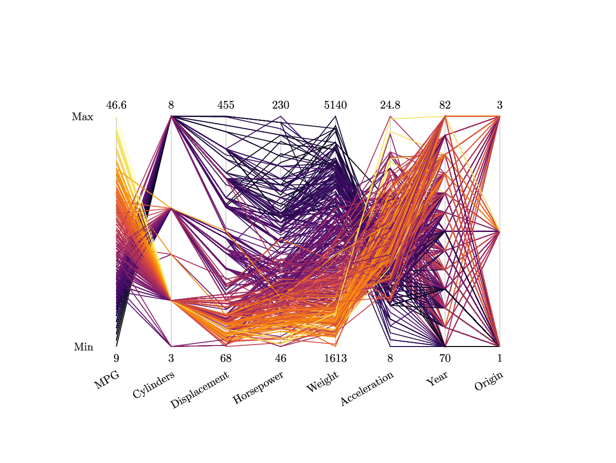 parallel.gle parallel.zip zip file contains all files for this figure.
! Example of parallel coordinates plot.
! Author: Francois Tonneau

include palettes.gle

size 16 12

set font ss

amove 3 3

! Load data and draw a frame around the plot area.

begin graph
    size 10 6
    fullsize
    data "parallel.dat"
    xaxis min 1 max ndatasets() ftick 1 dticks 1 angle 30
    yaxis min 0 max 1 ftick 0 dticks 1
    side   off
    ticks  off
    labels off
    labels dist 0.6
    xnames MPG Cylinders Displacement Horsepower Weight Acceleration Year Origin
    ynames Min Max
end graph

! Set graphic parameters.

nlines = ndata(d1) - 2  ! Last 2 rows in the file are min and max coordinates.

ymin_row = ndata(d1) - 1
ymax_row = ndata(d1)

naxes  = ndatasets()

! Draw coordinate axes inside the plot area.

set color gray20 lwidth 0.01
for axis = 1 to naxes
    amove xg(axis) yg(0)
    aline xg(axis) yg(1)
next axis

! Label each axis with minimum and maximum.

set color black hei 0.3 just cc
for axis = 1 to naxes
    min = datayvalue(d[axis], ymin_row)
    max = datayvalue(d[axis], ymax_row)
    amove xg(axis) yg(0)-0.3
    write min
    amove xg(axis) yg(1)+0.3
    write max
next axis

! Plot the data.

ymin_initial = datayvalue(d1, ymin_row)
ymax_initial = datayvalue(d1, ymax_row)

set lwidth 0.02
for line = 1 to nlines
    y_initial     = datayvalue(d1, line)
    ynorm_initial = (y_initial - ymin_initial) / (ymax_initial - ymin_initial)
    set color inferno(ynorm_initial)
    amove xg(1) yg(ynorm_initial)
    for axis = 2 to naxes
        ymin  = datayvalue(d[axis], ymin_row)
        ymax  = datayvalue(d[axis], ymax_row)
        y     = datayvalue(d[axis], line)
        ynorm = (y - ymin)/(ymax - ymin)
        aline xg(axis) yg(ynorm)
    next axis
next line
phasedemo.gle
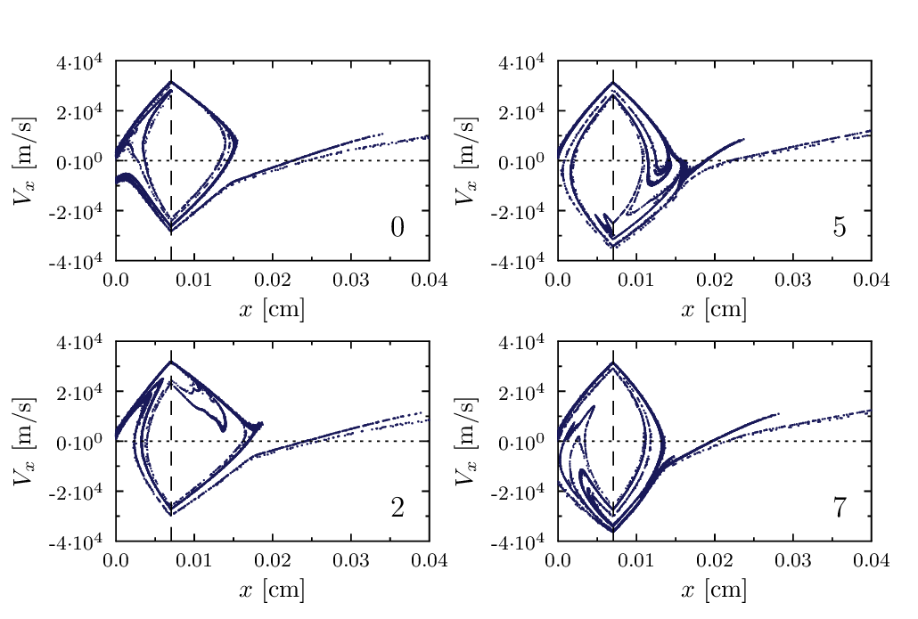 phasedemo.gle phasedemo.zip zip file contains all files for this figure.
size 13 8.75

set font texcmr texlabels 1
mscale = 0.1

sub plotphas name$ number x_pos y_pos
   set hei 0.35
   amove x_pos y_pos
   begin graph
      size 4.7 3
      scale 0.95 0.95
      xtitle "$x$ [cm]"
      ytitle "$V_x$ [m/s]"
      xaxis min 0      max 0.04  dticks 0.01
      yaxis min -40000 max 40000 dticks 2e4 format "sci 1 10"
      data name$+num$(number)+".s1.gz" d1=c1,c2
      data name$+num$(number)+".s2.gz" d2=c1,c2
      data name$+num$(number)+".s3.gz" d3=c1,c2
      data name$+num$(number)+".s4.gz" d4=c1,c2
      data name$+num$(number)+".s5.gz" d5=c1,c2
      data name$+num$(number)+".s6.gz" d6=c1,c2
      data name$+num$(number)+".s7.gz" d7=c1,c2
      d1 marker fcircle msize 0.15*mscale color dblue$
      d2 marker fcircle msize 0.13*mscale color dblue$
      d3 marker fcircle msize 0.11*mscale color dblue$
      d4 marker fcircle msize 0.09*mscale color dblue$
      d5 marker fcircle msize 0.07*mscale color dblue$
      d6 marker fcircle msize 0.06*mscale color dblue$
      d7 marker fcircle msize 0.05*mscale color dblue$
   end graph
   set lstyle 1 hei 0.4
   amove xg(0.035) yg(-30000)
   tex num1$(number)
   set lstyle 2
   amove xg(xgmin) yg(0)
   aline xg(xgmax) yg(0)
   set lstyle 9
   amove xg(0.0070536) yg(ygmin)
   aline xg(0.0070536) yg(ygmax)
   set lstyle 1
end sub

sub my_index number
   if number = 0 then return 0
   else if number = 1 then return 2
   else if number = 2 then return 5
   else if number = 3 then return 7
   end if
end sub

number = 0
deltax = 6.3; deltay = 4
posx = 1.5;   posy = 5
startposy = posy
dblue$ = "rgb255(25,25,89)"

for x = 1 to 2
   for y = 1 to 2
      plotphas "phas/phas" my_index(number) posx posy
      number = number+1
      posy = posy-deltay
   next y
   posy = startposy
   posx = posx+deltax
next x
rugplot.gle
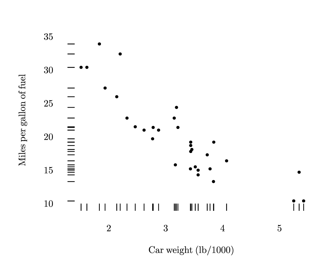 rugplot.gle rugplot.zip zip file contains all files for this figure.
! Example of rug plot.
! Author: Francois Tonneau

include rugs.gle

size 14 11.5

set font rm hei 0.5 lwidth 0.03

amove 1 1.5
begin graph
    size 14 10
    xaxis min 1.4 max 5.5 ftick 2 dticks 1
    yaxis min 10 max 35 ftick 10 dticks 5
    side  off
    ticks off
    labels dist 0.9
    xtitle "Car weight (lb/1000)" hei 0.4 dist 0.6
    ytitle "Miles per gallon of fuel" hei 0.4 dist 0.7
    data "rugplot.dat"
    d1 marker dot msize 0.3
end graph

! We add rugs to the plot, using a tick length of 0.3 cm (xrug and yrug also
! accept position and offset parameters, see rugs.gle for details).

xrug d1 0.3
yrug d1 0.3
sarppepo.gle
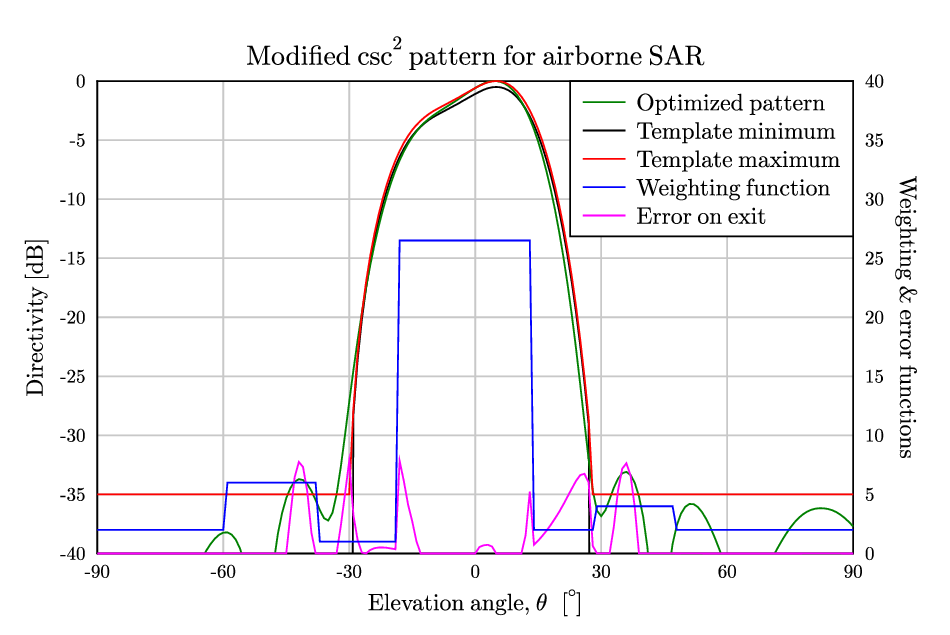 sarppepo.gle sarppepo.zip zip file contains all files for this figure.
! This GLE file contains an example of how one can make "different plots" on a common graph;
! "different" in the sense that one plot uses the normal (i.e. left side) y-axis, while the other
! plot(s) uses the y2-axis (i.e. the right side). The two y-axis ("y" and "y2") can have fully
! arbitrary values.

size 12 8

set font texcmr hei 0.3
begin graph
    scale   0.8 0.75
    title   "Modified csc^2 pattern for airborne SAR"
    xtitle  "Elevation angle, \theta \, [^{\circ}]"
    ytitle  "Directivity [dB]"
    y2title "Weighting & error functions" rotate
    xaxis  min -90 max +90 dticks 30 grid
    yaxis  min -40 max 0   dticks 5  grid
    y2axis min 0   max 40  dticks 5
    ticks color gray10
    data "sarppepo.err" ignore 2
!
!   The datafile (SARppEPO.err) looks like this (only first few lines shown):
!   Theta,      MIN,        A_dB,       MAX,          F_error,   WEIGHT
!  (F_error = Function value at the solution)
!  -90.000000  -99.000000  -50.167945  -35.000000     .000977    2.000000
!  -89.000000  -99.000000  -49.854909  -35.000000     .000983    2.000000
!  -88.000000  -99.000000  -49.580417  -35.000000     .000988    2.000000
!  ...
!  ...
!  ...
!   90.000000  -99.000000  -37.707631  -35.000000     .001226    2.000000
! Last line having "theta" = 90.0
!
    d1 line                      ! Plot the first curve ("MIN") using the default color: Black.
    d2 line color green          ! Plot the second curve ("A_dB") in green...
    d3 line color red            ! Plot the third curve ("MAX") in red...
    d4 line y2axis color magenta ! Plot value of the error function on exit...
    d5 line y2axis color blue    ! Plot weighting function...
end graph

begin key
   pos tr
   text "Optimized pattern"  line color green
   text "Template minimum"   line color black
   text "Template maximum"   line color red
   text "Weighting function" line color blue
   text "Error on exit"      line color magenta
end key
scatter_plot.gle
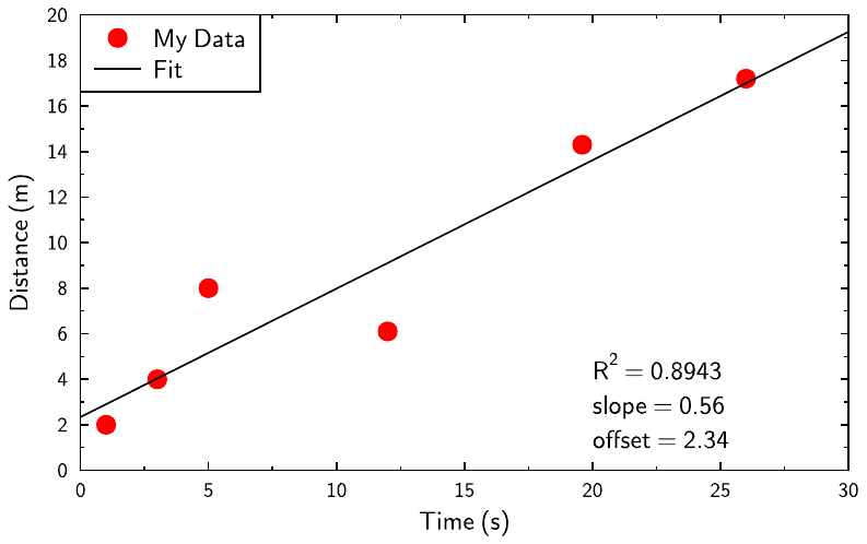 scatter_plot.gle scatter_plot.zip zip file contains all files for this figure.
!
!  ascatterplot.gle - A scatter plot - plots data contained in data.csv
!  and fits it with a straight line
!
size 10 10/1.6
set font texcmss
set hei 0.3
amove 0 0

begin graph
    scale auto
    data "data.csv" d1 = c1 , c2
    d1 marker fcircle color red key "My Data"
    let d2 = linfit d1 myslope myoffset myR2
    d2 line color black key "Fit"
    xtitle "Time (s)"
    ytitle "Distance (m)"
    key compact position tl
end graph
! display information on the graph
amove xg(20) yg(4)
write "R^2 = "+format$(myR2,"fix 4")
rmove 0 -0.4
write "slope = "+format$(myslope,"fix 2")
rmove 0 -0.4
write "offset = "+format$(myoffset,"fix 2")
SdHmethod.gle
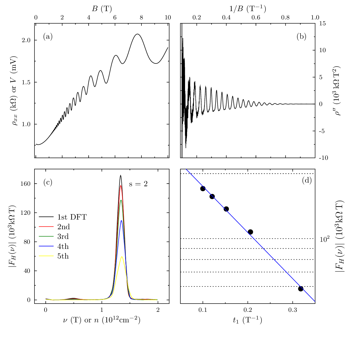 SdHmethod.gle SdHmethod.zip zip file contains all files for this figure.
!---------------------------------------------------------!
! This sequence of graphs illustrates the four main steps !
! to obtain the concentration and quantum mobility of two !
! dimensional electron gases using Shubnikov-de Haas      !
! measurements and Fourier transform.                     !
!                                                         !
! Author:  Ivan Ramos Pagnossin                           !
! Data:    2003.12.13                                     !
! Project: Master thesis                                  !
!---------------------------------------------------------!

size 16 15

set texlabels 1

!------------------- STEP 1 ------------------------
amove 1.5 8
begin graph
   size 6 6
   fullsize
   data "SdHmethod/step1.dat"
   d1 line smooth
   xaxis min -0.1 max 10.1 dticks 2   dsubticks 1
   yaxis min 0.6  max 2.2  dticks 0.5 dsubticks 0.25
   xlabels off
   x2labels on
   x2title "$B$ (T)"
   ytitle  "$\rho_{xx}$ $\mathrm{(k\Omega)}$ or $V$ (mV)"
end graph

set just cc
amove xg(xgmin)+0.6 yg(ygmax)-0.6
tex "(a)"

!------------------- STEP 2 ------------------------
amove 8 8
begin graph
   size 6 6
   fullsize
   data "SdHmethod/step2.dat"
   d1 line smooth
   xaxis min 0.09 max 1 dticks 0.2 dsubticks 0.1
   yaxis min -10  max 15
   xlabels off
   x2labels on
   ylabels off
   y2labels on
   x2title "$1/B$ $\mathrm{(T^{-1})}$"
   y2title "$\rho''$ $\mathrm{(10^3\,k\Omega\,T^2)}$"
end graph

amove xg(xgmax)-0.6 yg(ygmax)-0.6
tex "(b)"

!------------------- STEP 3 ------------------------
amove 1.5 1.5
begin graph
   size 6 6
   fullsize
   data "SdHmethod/FFT1.dat"
   data "SdHmethod/FFT2.dat"
   data "SdHmethod/FFT3.dat"
   data "SdHmethod/FFT4.dat"
   data "SdHmethod/FFT5.dat"
   d1 line smooth color black
   d2 line smooth color red
   d3 line smooth color green
   d4 line smooth color blue
   d5 line smooth color yellow
   xaxis min -0.2 max 2.2 dticks 1  dsubticks 0.5
   yaxis min -5   max 180 dticks 40 dsubticks 20
   xtitle "$\nu$ (T) or $n$ $\mathrm{(10^{12} cm^{-2})}$"
   ytitle "$|F_{H}(\nu)|$ $\mathrm{(10^3 k\Omega\, T)}$"
end graph

amove xg(xgmin)+0.6 yg(ygmax)-0.6
tex "(c)"

amove xg(1.65) yg(160)
tex "s = 2"

begin key
   nobox
   pos lc
   text "1st DFT" line color black
   text "2nd" line color red
   text "3rd" line color green
   text "4th" line color blue
   text "5th" line color yellow
end key

!------------------- STEP 4 ------------------------
amove 8 1.5
begin graph
   size 6 6
   fullsize
   data "SdHmethod/step4.dat"
   let d2 = logefit d1 from 0.05 to 0.35
   d1 marker fcircle msize 0.3
   d2 line color blue
   xaxis min 0.05 max 0.35 dticks 0.1 dsubticks 0.05
   yaxis min 50 max 210 log grid
   yticks lstyle 2
   ysubticks lstyle 2
   ylabels off
   y2labels hei 0.4
   y2labels on
   xtitle "$t_1$ $\mathrm{(T^{-1})}$"
   y2title "$|F_{H}(\nu)|$ $\mathrm{(10^3 k\Omega\, T)}$"
end graph

amove xg(xgmax)-0.6 yg(ygmax)-0.6
tex "(d)"
seaborn.gle
 seaborn.gle seaborn.zip zip file contains all files for this figure.
! Demo about plot theming.
! Author: Francois Tonneau

size 14 11

set font ss

! This plot is identical to the previous one, with the exception of theming.
! *The script won't compile unless the themes.gle library is present, either
! in the same directory or in GLE's custom-library directory, GLE_USRLIB.*

include themes.gle

amove 2 2
begin graph
    size 8 8
    fullsize
    xaxis min 4.15 max 8.25 dticks 1
    yaxis min 1.75 max 4.50 dticks 0.5

    ! The 'seaborn' theme is defined inside themes.gle.

    seaborn

    labels color black dist 0.3 hei 0.45

    xtitle "Sepal length (mm)" dist 0.5
    ytitle "Sepal width (mm)" dist 0.5

    data "seaborn.dat" d1=c1,c2 d2=c3,c4 d3=c5,c6

    d1 color seaborn_blue$   marker fcircle msize 0.23
    d2 color seaborn_orange$ marker fcircle msize 0.23
    d3 color seaborn_green$  marker fcircle msize 0.23

    let d4 = linfit d1 from 4.3 to 5.8
    let d6 = linfit d3 from 4.9 to 7.9
    let d5 = linfit d2 from 4.9 to 7.0

    begin layer 300
        d4 color seaborn_blue$   line lwidth 0.04
        d5 color seaborn_orange$ line lwidth 0.04
        d6 color seaborn_green$  line lwidth 0.04
    end layer
end graph

set hei 0.45
amove 10.50 8.80
write "Species:"

set hei 0.48 lwidth 0.05

begin key
    absolute 10.30 6.55 nobox llen 0.5
    line lwidth 0.04 color seaborn_blue$ marker fcircle msize 0.23 &
        text "{\it setosa}"
    line lwidth 0.04 color seaborn_orange$ marker fcircle msize 0.23 &
        text "{\it versicolor}"
    line lwidth 0.04 color seaborn_green$ marker fcircle msize 0.23 &
        text "{\it virginica}"
end key

! Done. We have learned about plot theming in GLE.
stack1.gle
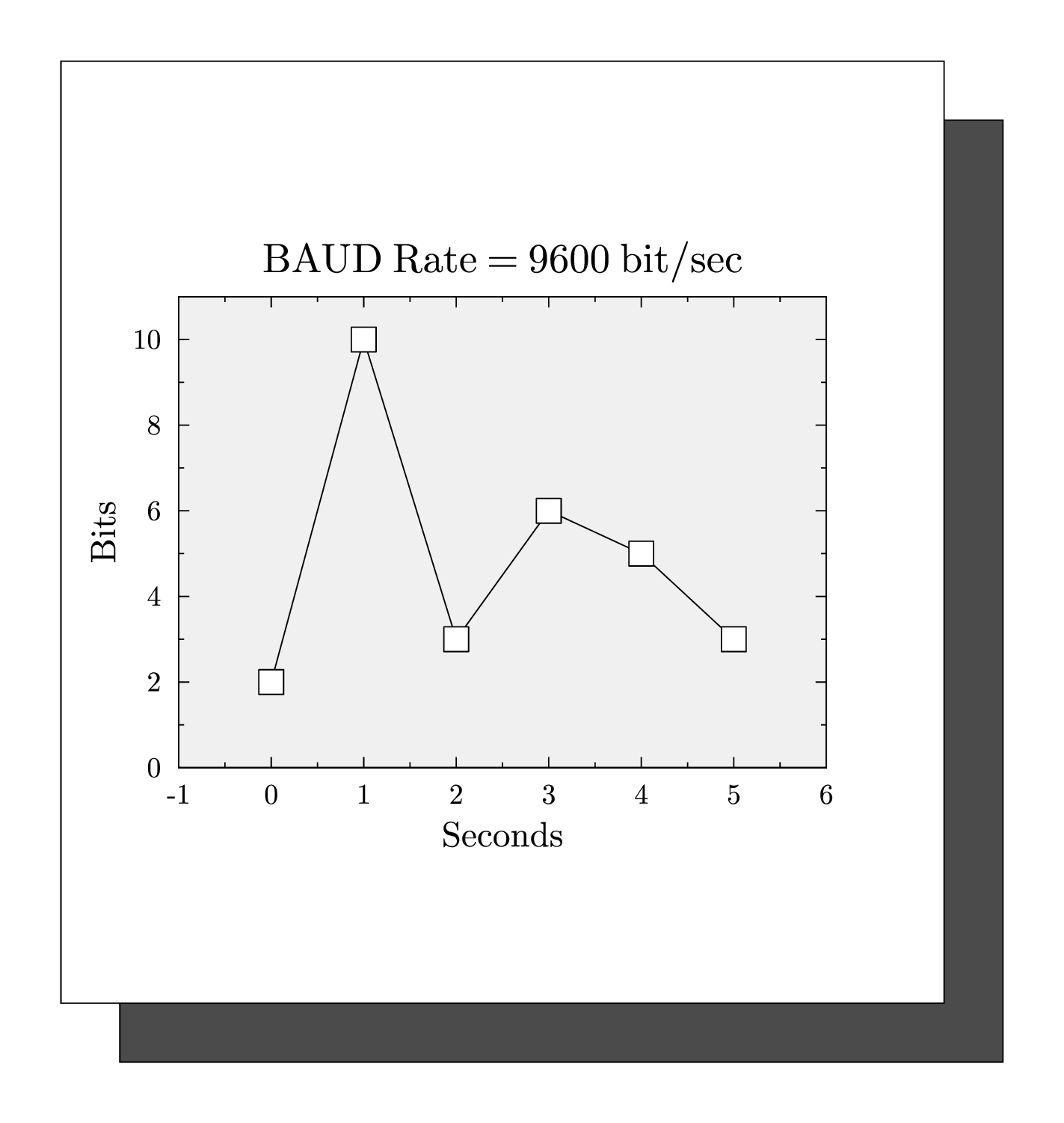 stack1.gle stack1.zip zip file contains all files for this figure.
size 18 19

amove 2 1
box 15 16 fill gray60
rmove -1 1
box 15 16 fill white
rmove 2 4
box 11 8 fill gray5

set font texcmr hei 0.6

begin graph
    fullsize
    size 11 8
    title "BAUD Rate = 9600 bit/sec"
    xtitle "Seconds"
    ytitle "Bits"
    data "test.dat"
    d1 line marker wsquare
    xaxis min -1 max 6
    yaxis min 0 max 11
end graph
stack2.gle
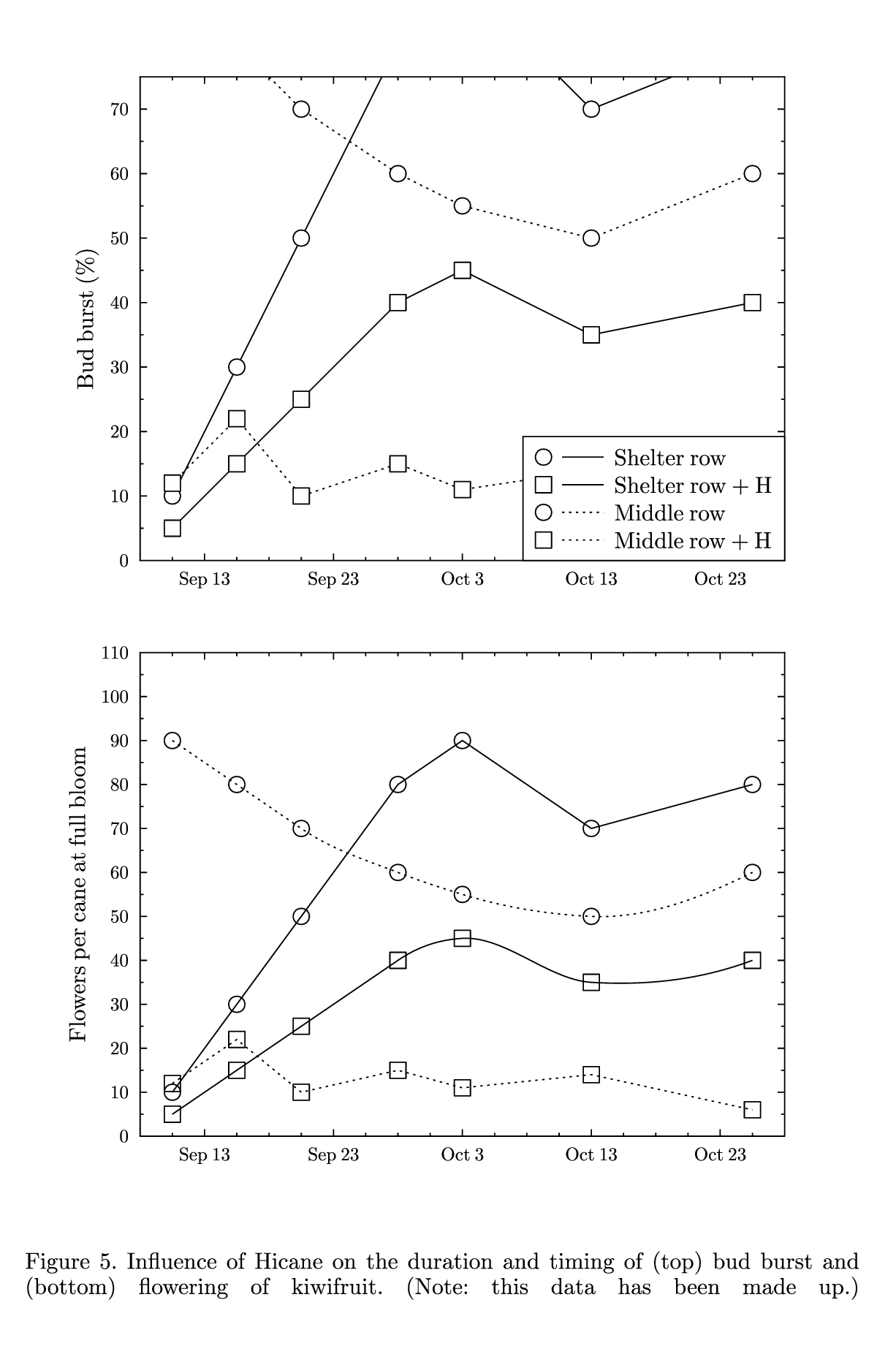 stack2.gle stack2.zip zip file contains all files for this figure.
size 15.5 23.5
set font texcmr hei 0.4

amove 0 12
begin graph
   size 16 12
   ytitle  "Bud burst (%)"
   xaxis min 0 max 20 dticks 4  dsubticks 1
   yaxis min 0 max 75 dticks 10 dsubticks 5
   xplaces 2        6        10      14       18
   xnames  "Sep 13" "Sep 23" "Oct 3" "Oct 13" "Oct 23"
   data    "test4.dat"
   key pos br
   d1 lstyle 1 marker wcircle key "Shelter row"
   d2 lstyle 1 marker wsquare key "Shelter row + H"
   d3 lstyle 2 marker wcircle key "Middle row"
   d4 lstyle 2 marker wsquare key "Middle row + H"
end graph

amove 0 2
begin graph
   size 16 12
   ytitle "Flowers per cane at full bloom"
   xaxis min 0 max 20  dticks 4  dsubticks 1
   yaxis min 0 max 110 dticks 10 dsubticks 5
   xplaces 2        6        10      14       18
   xnames  "Sep 13" "Sep 23" "Oct 3" "Oct 13" "Oct 23"
   data    "test4.dat"
   d1 lstyle 1 marker circle
   d2 lstyle 1 marker square smooth
   d3 lstyle 2 marker circle smooth
   d4 lstyle 2 marker square
end graph

amove 0.4 1.5
begin text width 14.5
   Figure 5. Influence of Hicane on the duration and timing of (top) bud burst
   and (bottom) flowering of kiwifruit.  (Note: this data has been made up.)
end text
stack4b.gle
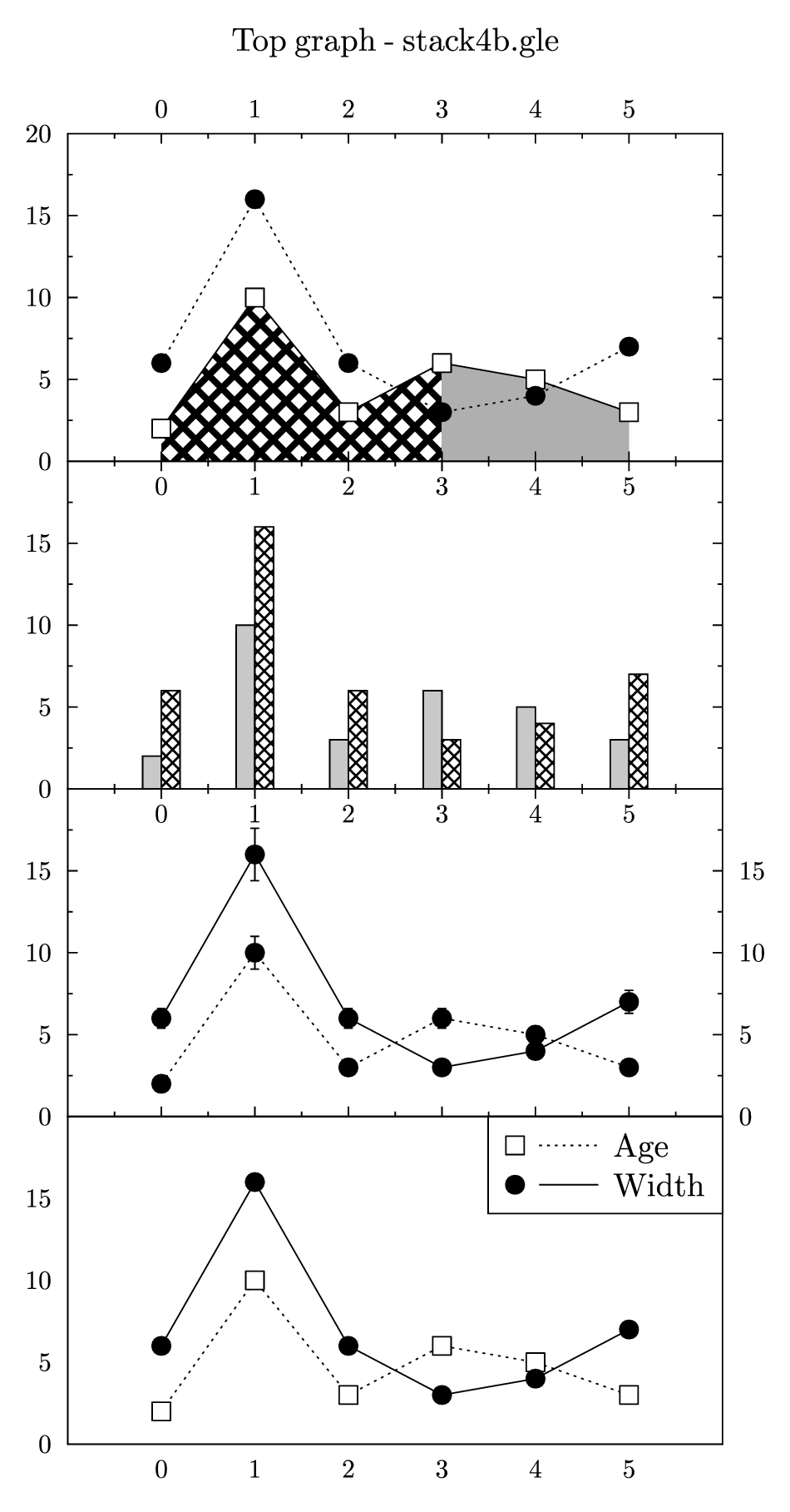 stack4b.gle stack4b.zip zip file contains all files for this figure.
size 12 23
set font texcmr hei 0.5

amove 1 16
begin graph
   size 10 5
   data test.dat
   title "Top graph - stack4b.gle" hei .5 dist 0.75
   fullsize
   xaxis min -1 max 6 dticks 1 nofirst nolast
   yaxis min 0 max 20 dticks 5
   x2labels on
   d1 marker wsquare msize 0.4 lstyle 1
   d2 marker fcircle msize 0.4 lstyle 2
   fill x1,d1 color grid4 xmax 3
   fill x1,d1 color gray20 xmin 3
end graph

rmove 0 -5
begin graph
   size 10 5
   data test.dat
   fullsize
   xaxis min -1 max 6 dticks 1 nofirst nolast
   yaxis min 0 max 20 dticks 5 nolast
   bar d1,d2 width .2 dist .2 fill gray10,grid3 color black,black
end graph

rmove 0 -5
begin graph
   data test.dat
   fullsize
   size 10 5
   xaxis min -1 max 6 dticks 1 nofirst nolast
   yaxis min 0 max 20 dticks 5 nolast
   xlabels off
   y2labels on
   d1 marker fcircle msize 0.4 lstyle 2 err 10%
   d2 marker fcircle msize 0.4 lstyle 1 err 10%
end graph

rmove 0 -5
begin graph
   data test.dat
   fullsize
   size 10 5
   xaxis min -1 max 6 dticks 1 nofirst nolast grid
   yaxis min 0 max 20 dticks 5 nolast grid
   xticks lstyle 2 lwidth 0.0001    ! sets the grid line style
   yticks lstyle 2 lwidth 0.0001
   d1 marker wsquare msize 0.4 lstyle 2 key "Age"
   d2 marker fcircle msize 0.4 lstyle 1 key "Width"
end graph
stack4c.gle
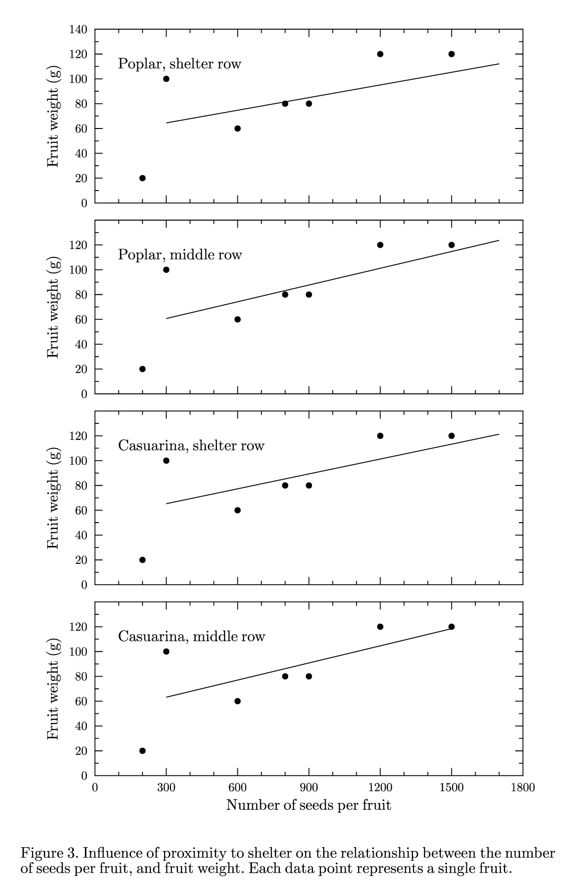 stack4c.gle stack4c.zip zip file contains all files for this figure.
size 15 23
set font texcmr hei 0.4

begin translate -1.25 -2.25
amove 1.3 19
begin graph
   size 16 6.5
   xaxis min 0 max 1800 dticks 300 dsubticks 100
   yaxis min 0 max 140 dticks 20 dsubticks 10
   xlabels off
   xticks length .2
   ylabels hei .4
   yticks length .2
   ytitle "Fruit weight (g)" hei .4
   data testc.dat
   d1 marker fcircle msize 0.2
   let d2 = (54.3+0.034*(x)) from 300 to 1700
   d2 line
end graph
rmove 3 4.5
text Poplar, shelter row

amove 1.3 14
begin graph
   size 16 6.5
   xaxis min 0 max 1800 dticks 300 dsubticks 100
   yaxis min 0 max 140 dticks 20 dsubticks 10 nolast
   xlabels off
   xticks length .2
   yticks length .2
   ylabels hei .4
   ytitle "Fruit weight (g)"  hei .4
   data testc.dat
   d1 marker fcircle msize 0.2
   let d2 = (47.2+0.045*(x)) from 300 to 1700
   d2 line
end graph
rmove 3 4.5
text Poplar, middle row

amove 1.3 9
begin graph
   size 16 6.5
   xaxis min 0 max 1800 dticks 300 dsubticks 100
   yaxis min 0 max 140 dticks 20 dsubticks 10 nolast
   xticks length .2
   xlabels off
   ylabels  hei .4
   yticks length .2
   ytitle "Fruit weight (g)" hei .4
   data testc.dat
   d1 marker fcircle msize 0.2
   let d2 = (53.3+0.040*(x)) from 300 to 1700
   d2 line
end graph
rmove 3 4.5
text Casuarina, shelter row

amove 1.3 4
begin graph
   size 16 6.5
   xaxis min 0 max 1800 dticks 300 dsubticks 100
   yaxis min 0 max 140 dticks 20 dsubticks 10 nolast
   xticks length .2
   xlabels hei .4
   yticks length .2
   ylabels hei .4
   ytitle "Fruit weight (g)" hei .4
   xtitle "Number of seeds per fruit"   hei .4
   data testc.dat
   d1 marker fcircle msize 0.2
   let d2 = (49.4+0.046*(x)) from 300 to 1500
   d2 line
end graph
rmove 3 4.5
text Casuarina, middle row
end translate

set just bc
amove pagewidth()/2 0.1
begin text width 14
\setstretch{.1}Figure 3. Influence of proximity to shelter on the
relationship between the number of seeds per fruit, and fruit weight.
Each data point represents a single fruit.
end text
tgplot.gle
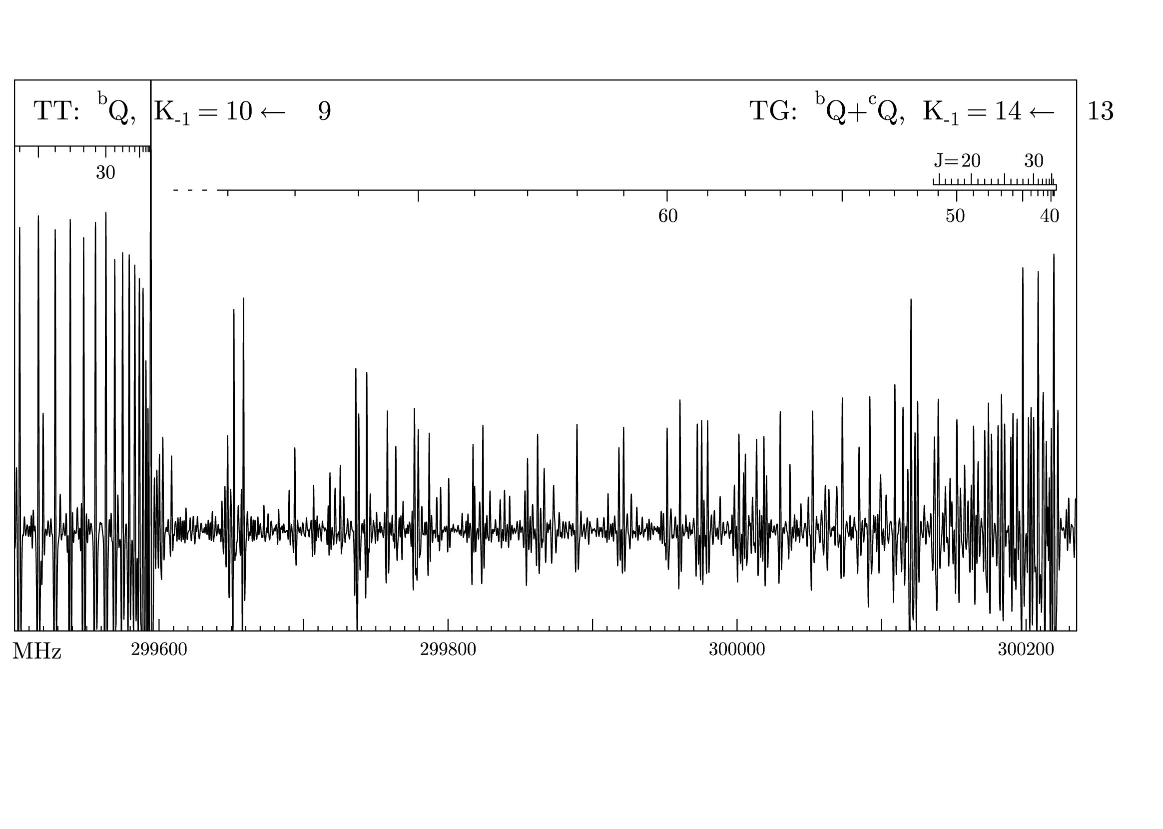 tgplot.gle tgplot.zip zip file contains all files for this figure.
!---------------------------------------------------------------------------
!      Plot of spectrum from file:  C:\ROT\ether\S\ohio\ether_o2b.spe
!---------------------------------------------------------------------------

size 29.5 21

set lwidth 0.025 join round font texcmr

amove -5.45  2.00
begin graph
    size 38.57 20.00
    d1 bigfile tgplot.dat
    xaxis  min  299500.02 max  300235.00 dticks    100.00 dsubticks    10.000
    x2ticks off
    xticks length 0.3
    xsubticks length 0.12
    xlabels hei 0.6
    yaxis min  0.0 max 1.0
    ylabels off
    yticks off
    d1 line
    d2 bigfile tgplota.dat
    d2 lstyle 1
    d3 bigfile tgplotb.dat
    d3 lstyle 1
    xplaces    299600   299700   299800   299900   300000   300100   300200
    xnames "   299600"   " "   "   299800"   " "   "   300000"   " "   "   300200"
end graph

set hei 0.6
amove 0.27  4.3
text MHz

set hei 0.7
amove 0.8 18.
text {\rm TT:}\, ^bQ{\rm,}\, {{\it K}_{{\tt-}{\rm1}}} {\rm = 10 \leftarrow\:\,9}

amove 19 18.
text {\rm TG:}\, ^bQ{\rm+}^cQ{\rm,}\, {{\it K}_{{\tt-}{\rm1}}} {\rm = 14 \leftarrow\:\,13}

set hei 0.5
labver=16.8
labbot=labver-1.4
amove 24.4 labver
text 20
amove 26.0 labver
text 30
amove 26.4 labbot
text 40
amove 24.0 labbot
text 50
amove 16.7 labbot
text 60

amove 2.4 16.5
text 30

amove 23.7 labver
text {\it J}=
zoom-in.gle
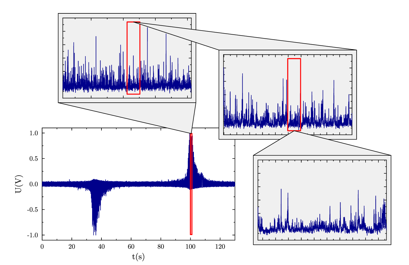 zoom-in.gle zoom-in.zip zip file contains all files for this figure.
size 17.75 11.5

set font texcmr

! Provided by Bükki-Deme András.

begin graph
   size 12 7
   data "kep/kep4-0.csv"
   xtitle "t(s)"
   ytitle "U(V)"
   yaxis min -1.1 max 1.1
   xaxis min 0 max 130
   d1 line color darkblue
end graph

zoom1a = 20455852; zoom1b = 20655999
zoom2a = 20555925; zoom2b = 20575925
zoom3a = 20565925; zoom3b = 20567925

sub zoom_in xa xb x1 x2 data$ from$ to$
   save "pos"
   ! draw red square on graph to indicate zoom region
   gsave
      set color red lwidth 0.04
      amove xg(xa) yg(ygmin)+0.05*(yg(ygmax)-yg(ygmin))
      box xg(xb)-xg(xa) 0.9*(yg(ygmax)-yg(ygmin)) name "box"
   grestore
   ! draw graph
   move "pos"
   begin box fill grey5 add 0.2 name "graph"
      begin graph
         size 8 5
         data "kep/"+data$
         xlabels off
         ylabels off
         xaxis min x1 max x2
         yaxis min -0.1 max 0.5
         d1 line color darkblue
      end graph
   end box
   ! connect graph with zoom region
   set join round
   begin path fill grey5 stroke
      move "box."+from$+"c"
      aline ptx("graph."+to$+"l") pty("graph."+to$+"l")
      aline ptx("graph."+to$+"r") pty("graph."+to$+"r")
      closepath
   end path
end sub

amove 1.5 6.5
zoom_in 100 101 zoom1a zoom1b "kep4-1.csv" "t" "b"

amove 8.5 4.9
zoom_in zoom2a zoom2b zoom2a zoom2b "kep4-2.csv" "t" "t"

amove 10 0.3
zoom_in zoom3a zoom3b zoom3a zoom3b "kep4-3.csv" "b" "t"