Bar Plots
Plots using bars to depict quantities and histograms.
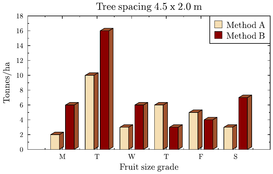
bar_chart.gle
 bar_chart.gle bar_chart.zip zip file contains all files for this figure.
!
! -- Bar Chart with 3D bars
!
size 11 7
set font texcmr

begin graph
   scale  auto
   data   "bar_chart.csv"
   title  "Tree spacing 4.5 x 2.0 m"
   xtitle "Fruit size grade"
   ytitle "Tonnes/ha"
   key pos tr
   bar d1,d2 fill wheat,darkred dist 0.43 3d 0.5 0.3 side sienna,sienna top sienna,sienna
end graph
bar_chart_ft.gle
 bar_chart_ft.gle bar_chart_ft.zip zip file contains all files for this figure.
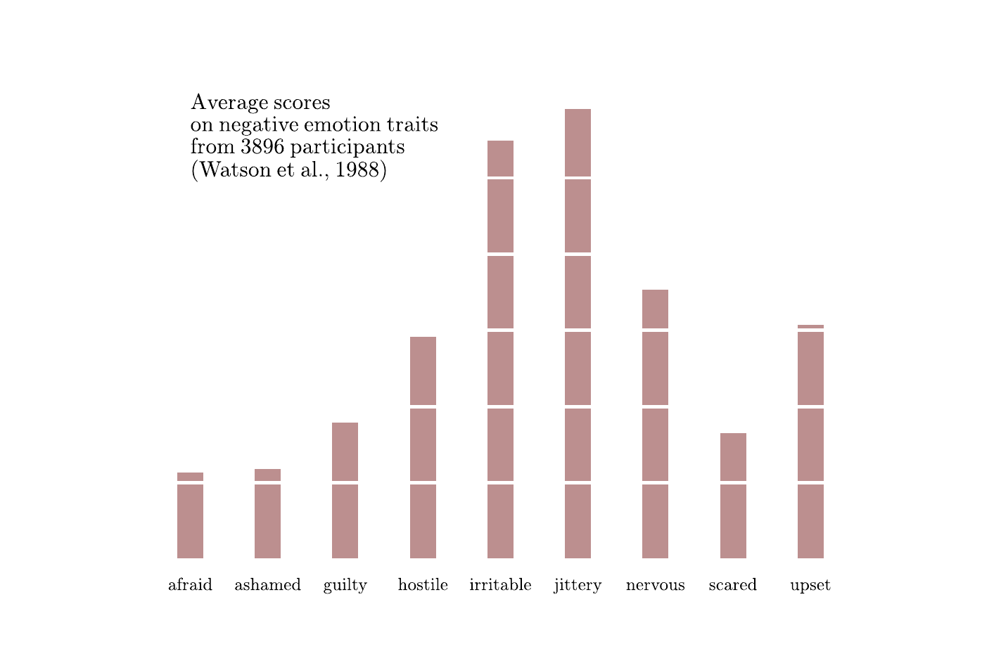
! Example of bar chart.
! Author: Francois Tonneau

size 18 12

set font rm

! We setup a white grid for the y axis, and we plot the data in a low-rank
! layer (< 200) so that the white grid runs over it.

begin graph
    xaxis min 0.5 max 9.5 ftick 1 dticks 1
    yaxis min -0.1 max 6 ftick 1 dticks 1 nolast grid color white lwidth 0.06
    side   off
    xticks off
    xlabels hei 0.4
    ylabels hei 0.5
    xnames &
        afraid ashamed guilty hostile irritable jittery nervous scared upset
    data "bar_chart_ft.dat"
    begin layer 150
        bar d1 width 0.35 fill rosybrown color white
    end layer
end graph

amove xg(1) 8.75
set color black hei 0.4 just bl
begin text
    Average scores
    on negative emotion traits
    from 3896 participants
    (Watson et al., 1988)
end text
colorbar.gle
 colorbar.gle colorbar.zip zip file contains all files for this figure.
size 12 8
include "barstyles.gle"
set font texcmr
begin graph
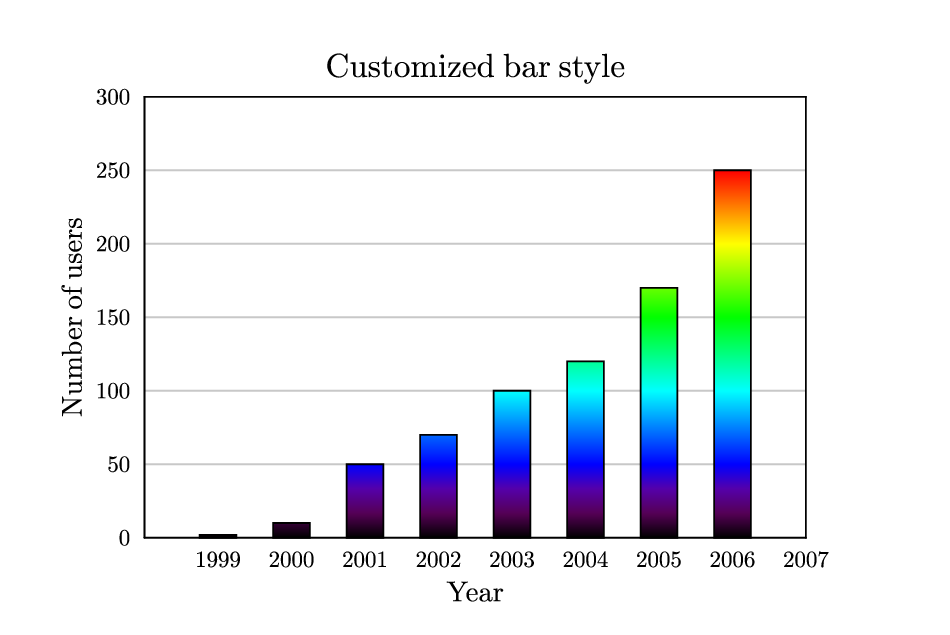
title "Customized bar style"
ytitle "Number of users"
xtitle "Year"
data "colorbar.dat"
xticks off
yticks color gray10
yaxis grid
xaxis nofirst
bar d1 style colormap
end graph
decay.gle
 decay.gle decay.zip zip file contains all files for this figure.
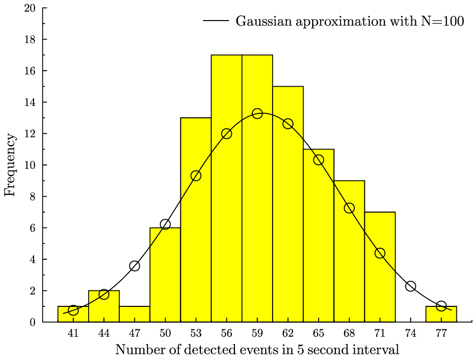
! Demonstration of the bar command with data from radioactive decay

size 12 9

mu = 59.51; sigma = mu^0.5      ! These are the parameters of the gaussian approximation
N = 100                         ! The number of timed intervals

sub gaussian x
   return (N/3)/((2*pi)^0.5)*exp(-((x-mu)^2)/(2*sigma^2))
end sub

set font texcmr
begin graph
   scale auto
   xtitle "Number of detected events in 5 second interval"
   ytitle "Frequency"
   xaxis min 38 max 80 ftick 41 dticks 3 nolast
   yaxis max 20
   x2axis off
   y2axis off
   key pos tr nobox
   data "decay.dat"                                ! Data taken from the experiment
   let d2 = gaussian(x) from 40 to 78              ! Sets our Gaussian into both "continuous" and
   let d3 = gaussian(x) from 41 to 77 step 3       ! discrete forms
   bar d1 width 3 fill yellow
   d2 line key "Gaussian approximation with N=100"
   d3 marker circle
end graph
errors.gle
 errors.gle errors.zip zip file contains all files for this figure.
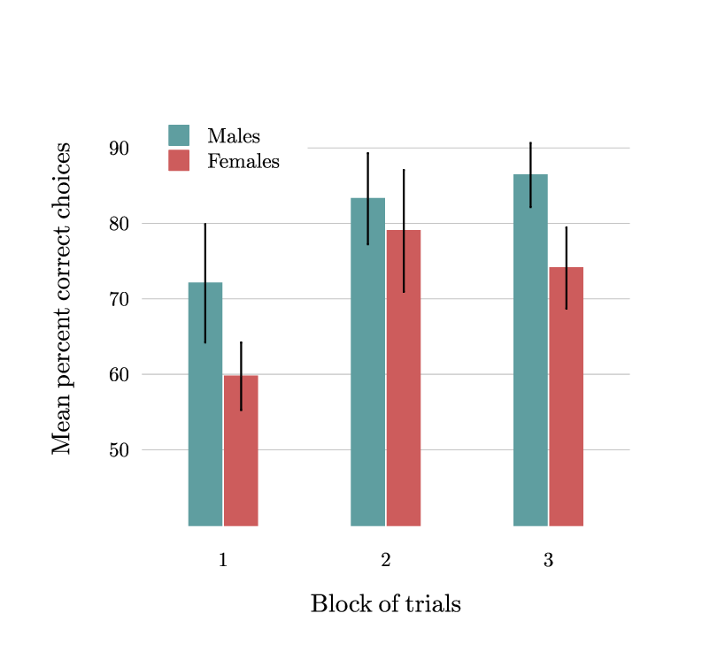
! Example with grouped bars and error lines.
! Author: Francois Tonneau

size 10 9.5

set font ss

amove 2 2
begin graph
    size 7 6.5
    fullsize
    xaxis min 0.5 max 3.5 ftick 1 dticks 1
    yaxis min 40 max 100 ftick 40 dticks 10 nofirst nolast
    yaxis grid lwidth 0.01 color #c4c4c4
    x2axis off
    y2axis off
    xticks off
    side   off
    xlabels dist 0.4
    ylabels color black
    xtitle "Block of trials" dist 0.4
    ytitle "Mean percent correct choices" dist 0.5

    ! When loading error.dat, datasets d1 and d3 will contain bar heights
    ! whereas datasets d2 and d4 will contain error magnitudes.

    data "errors.dat"

    ! We draw grouped bars of our data with the 'bar d1,d3' syntax. The 'dist'
    ! parameter affects the horizontal separation between bars:

    bar d1,d3 width 0.20 dist 0.22 color cadetblue,indianred &
        fill cadetblue,indianred

    ! GLE adds error lines to dataset d1, based on the values from dataset d2,
    ! with the following syntax:

    ! d1 err d2 lwidth ... errwidth ...

    ! When drawing grouped bars, however, GLE shifts the bars slightly left and
    ! right of the central tick. So, if we want our d2 and d4 error lines to be
    ! placed correctly, we cannot draw them directly atop d1 and d3. Rather, we
    ! must draw the lines on the top of datasets with shifted x values. Here
    ! the 'let dn = x-expression, y-expression' syntax comes in handy:

    let d5 = x-0.22/2, d1
    let d6 = x+0.22/2, d3

    ! We can now draw the d2 and d4 error lines atop d5 and d6. The error lines
    ! will appear centered above the bars of d1 and d3:

    d5 err d2 lwidth 0.025 errwidth 0.025
    d6 err d4 lwidth 0.025 errwidth 0.025

    ! (Of course, there is no need to create shifted datasets when adding error
    ! lines to a marker plot, for example. The present complications arose only
    ! because we used grouped bars.)
end graph

! We conclude with the plot legend:

begin box fill white add 0.4 nobox
    set hei 0.3
    begin key
        absolute 2.1 7.9 just tl nobox compact
        marker fsquare color cadetblue msize 0.4 text "Males"
        marker fsquare color indianred msize 0.4 text "Females"
    end key
end box

! Done. We have learned about grouped bars and error lines.
four.gle
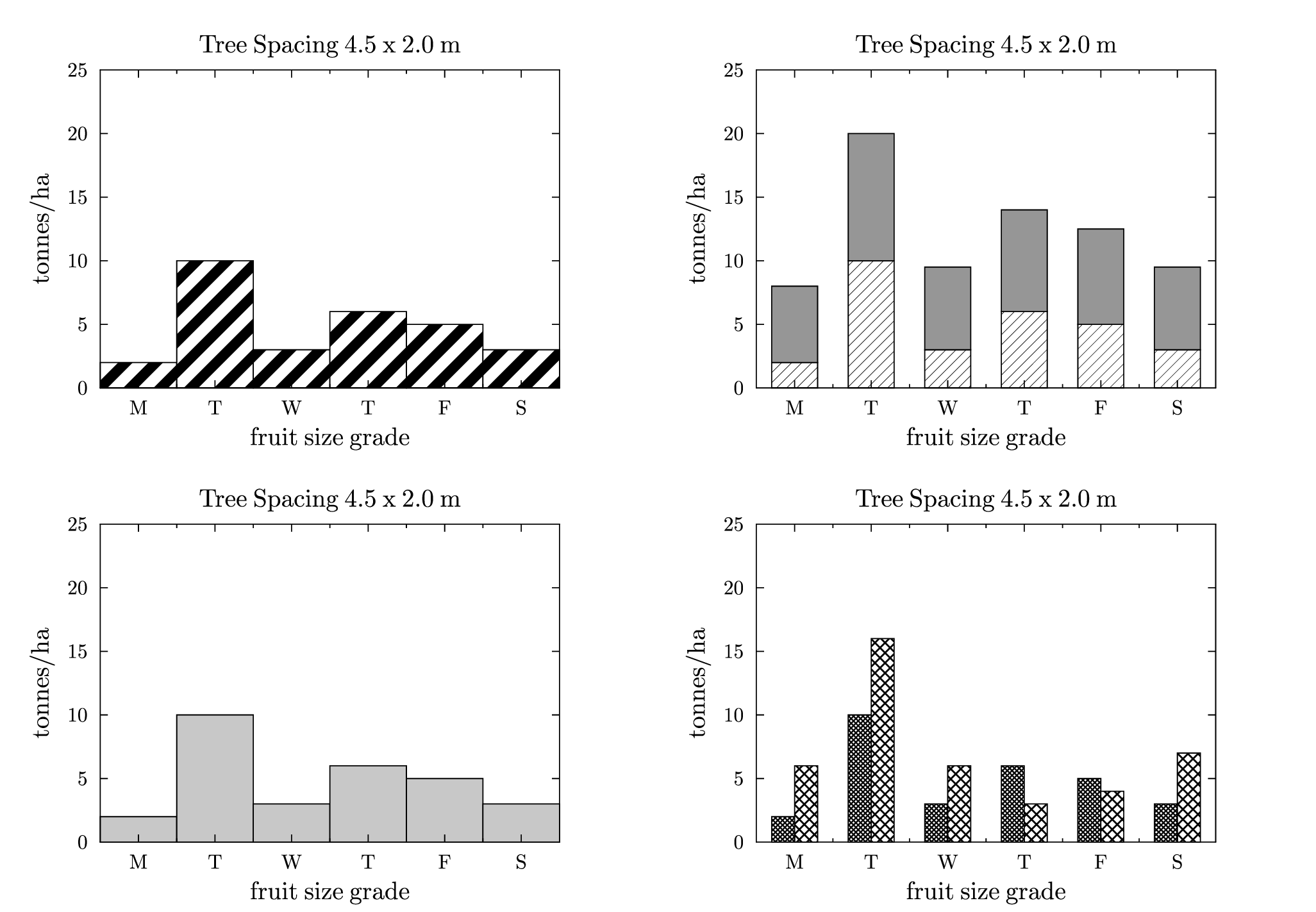 four.gle four.zip zip file contains all files for this figure.
size 26 18
set font texcmr hei 0.5 titlescale 1

amove  0 0
begin graph
   size 13 9
   title  "Tree Spacing 4.5 x 2.0 m"
   xtitle "fruit size grade"
   ytitle "tonnes/ha"
   data   "test.dat"
   xaxis  min -0.5 max 5.5 dticks 1
   yaxis  min 0 max 25 dsubticks 10
   xnames "M" "T" "W" "T" "F" "S"
   bar d1 width 1.0 fill gray10
end graph

amove  0 9
begin graph
   size 13 9
   title  "Tree Spacing 4.5 x 2.0 m"
   xtitle "fruit size grade"
   ytitle "tonnes/ha"
   data   "test.dat"
   xaxis  min -0.5 max 5.5 dticks 1
   yaxis  min 0 max 25 dsubticks 10
   xnames "M" "T" "W" "T" "F" "S"
   bar d1 width 1.0 fill shade5
end graph

amove  13 9
begin graph
   size 13 9
   title  "Tree Spacing 4.5 x 2.0 m"
   xtitle "fruit size grade"
   ytitle "tonnes/ha"
   data   "test.dat"
   xaxis  min -0.5 max 5.5 dticks 1
   yaxis  min 0 max 25 dsubticks 10
   xnames "M" "T" "W" "T" "F" "S"
   bar d1 width 0.6 fill shade
   let d3 = d1+5+0.5*d1
   bar d3 from d1 width 0.6 fill gray30
end graph

amove  13 0
begin graph
   size 13 9
   title  "Tree Spacing 4.5 x 2.0 m"
   xtitle "fruit size grade"
   ytitle "tonnes/ha"
   data   "test.dat"
   xaxis  min -0.5 max 5.5 dticks 1
   yaxis  min 0 max 25 dsubticks 10
   xnames "M" "T" "W" "T" "F" "S"
   bar d1,d2 fill grid1,grid3 width 0.3 dist 0.3
end graph
fruitbar.gle
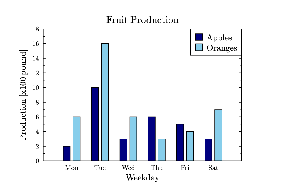 fruitbar.gle fruitbar.zip zip file contains all files for this figure.
size 12 8

set font texcmr
begin graph
   title  "Fruit Production"
   xtitle "Weekday"
   ytitle "Production [x100 pound]"
   xticks off
   data   "test.dat"
   bar d1,d2 fill navy,skyblue
end graph
labels.gle
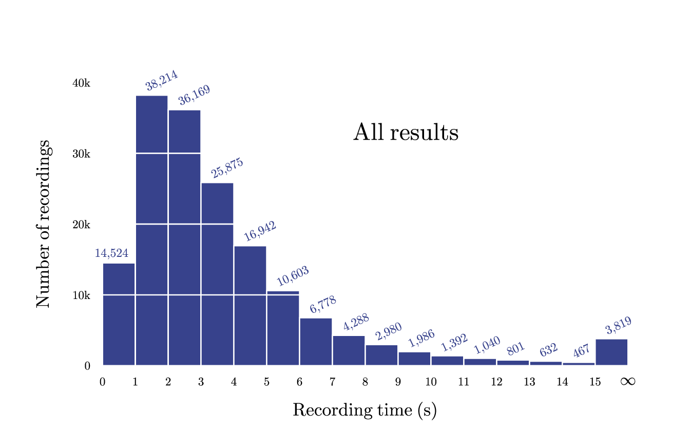 labels.gle labels.zip zip file contains all files for this figure.
! Example with labeled bars.
! Author: Francois Tonneau

include graphutil.gle

size 17 11

set font ss

amove 2.5 2
begin graph
    size 13 7
    fullsize
    xaxis min 0 max 16 ftick 0 dticks 1 nolast
    yaxis min 0 max 40000 ftick 0 dticks 10000 grid color white lwidth 0.03
    side   off
    xticks off
    ynames 0 10k 20k 30k 40k
    labels color black dist 0.3
    xtitle "Recording time (s)" hei 0.45 dist 0.4
    ytitle "Number of recordings" hei 0.45 dist 0.5
    data "labels.dat"
    begin layer 150
        bar d1 width 1 color white lwidth 0.03 fill #37428C
    end layer
end graph

! We add bar labels. Each label is prettified with the 'grouped$' subroutine
! defined in strings.gle. The number of digits per group is 3, a comma is the
! group separator.

include strings.gle

set hei 0.3 color #37428C

sub put_number index dx dy angle
    local x = dataxvalue(d1, index)
    local y = datayvalue(d1, index)
    local label$ = grouped$(num$(y), 3, ",")
    amove xg(x)+dx yg(y)+dy
    begin rotate angle
        write label$
    end rotate
end sub

put_number 1 -0.6 0.15 0

for num = 2 to ndata(d1)
    put_number num -0.1 0.1 25
next num

! We add a plot title and the missing last tick.

set color black just tc hei 0.6

amove 10 8
write "All results"

set hei 0.4

amove xg(16) yg(0)-0.3
write "\infty"
normal.gle
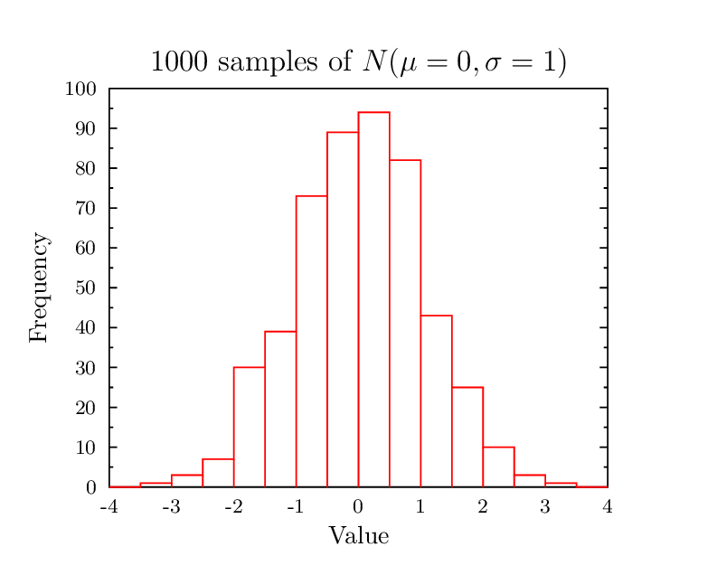 normal.gle normal.zip zip file contains all files for this figure.
size 10 8

set texlabels 1
begin graph
   title  "1000 samples of $N(\mu=0, \sigma=1)$"
   ytitle "Frequency"
   xtitle "Value"
   data   "normal.csv"
   xticks off
   yaxis max 100
   let d2 = hist d1 step 0.5
   d2 line bar color red
end graph
series.gle
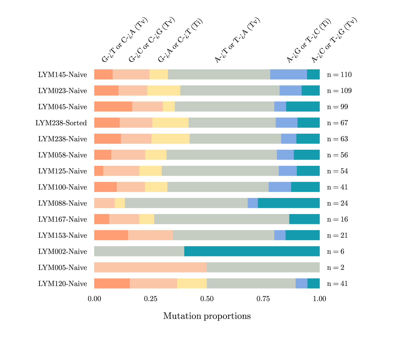 series.gle series.zip zip file contains all files for this figure.
! Example of horizontal bar chart.
! Author: Francois Tonneau

size 22 18

set font ss

! We first define colors for the bar plot.

barcolor_1$ = "#ff9e74"
barcolor_2$ = "#fac6a7"
barcolor_3$ = "#ffe69e"
barcolor_4$ = "#c5ccc2"
barcolor_5$ = "#82abe6"
barcolor_6$ = "#149cae"

amove 5 2.5

begin graph
    size 12 12
    fullsize
    xaxis min 0 max 1 dticks 0.25 format "fix 2"
    yaxis min 0.5 max 14.5 dticks 1
    yaxis negate     ! Invert axis so that data are drawn from top to bottom.

    ticks off
    side  off

    xtitle "Mutation proportions" dist 0.6
    labels hei 0.5 color black
    xlabels dist 0.25
    ylabels dist 0.40
    x2places 0.05 0.17 0.30 0.55 0.87 0.98
    x2names &
        "G->T or C->A (Tv)" "G->C or C->G (Tv)" &
        "G->A or C->T (Ti)" "A->T or T->A (Tv)" &
        "A->G or T->C (Ti)" "A->C or T->G (Tv)"
    x2labels dist 0.1
    x2axis angle 45

    data "series.dat"
    ynames from d7
    y2names from d8

    ! We will use stacked bars, so we need to cumulate the data after the first
    ! bar. This can be done with a loop starting at 2:

    for num = 2 to 6
        let d[num] = d[num-1]+d[num]
    next num

    ! We now plot the data with the 'bar dn from dm ...' syntax. The bars are
    ! horizontal ('horiz'), with a color depending on the current bar number.
    ! Each color is computed via GLE's 'eval' string-replacement facility:

    bar d1 horiz width 0.6 color barcolor_1$ fill barcolor_1$
    for num = 2 to 6
        barcolor$ = eval("barcolor_" + num + "$")
        bar d[num] from d[num-1] horiz width 0.6 color barcolor$ fill barcolor$
    next num
end graph
shadebar.gle
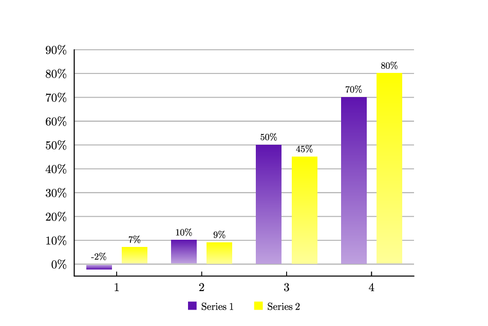 shadebar.gle shadebar.zip zip file contains all files for this figure.
size 12 8

include "color.gle"
include "barstyles.gle"

sub bar_purplecolormap x1 y1 x2 y2 bar group
  set_palette_shade_gray_color red 94 green 19 blue 175
  bar_colormap_palette_labels x1 y1 x2 y2 bar palette_shade_gray "fix 0 append '%'"
end sub

sub bar_yellowcolormap x1 y1 x2 y2 bar group
  set_palette_shade_gray_color red 255 green 255 blue 0
  bar_colormap_palette_labels x1 y1 x2 y2 bar palette_shade_gray "fix 0 append '%'"
end sub

set font texcmr
begin graph
  x2axis off
  y2axis off
  xaxis min 0.5 max 4.5 dticks 1
  yaxis min -5  max 90  dticks 10 format "fix 0 append '%'" grid
  xsubticks off
  yticks color grey20
  data "shadebar.csv"
  bar d1,d2 width 0.3,0.3 style purplecolormap,yellowcolormap
end graph

begin key
  position bc coldist 0.5 offset 0 -0.5 nobox hei 0.25 boxcolor clear
  fill rgb255(94,19,175) text "Series 1" separator
  fill rgb255(255,255,0) text "Series 2"
end key
stacks.gle
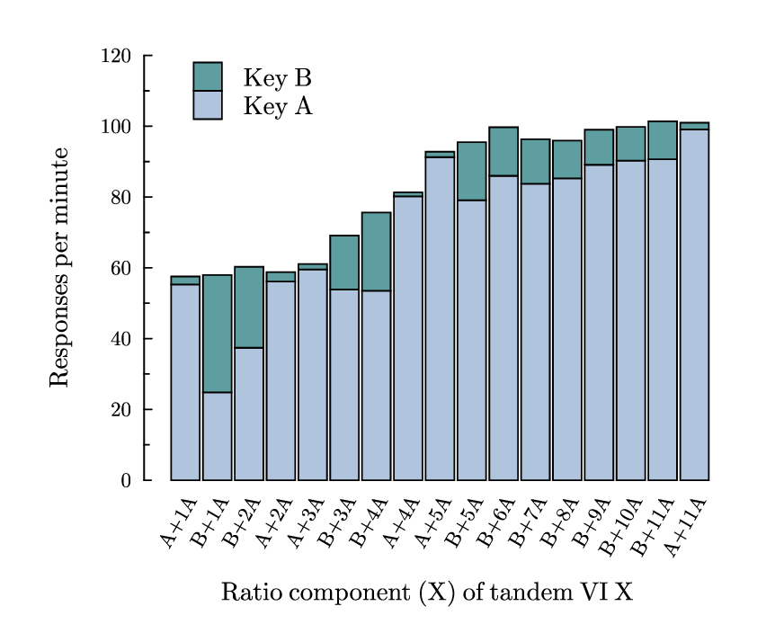 stacks.gle stacks.zip zip file contains all files for this figure.
! Example with stacked bars.
! Author: Francois Tonneau

size 11 9

set font ss cap round

amove 2 2.25
begin graph
    size 8 6
    fullsize

    xaxis min -0.3 max 17.5 ftick 1 dticks 1
    yaxis min 0 max 120

    x2axis off
    y2axis off
    xside  off
    xticks off

    ! We use the 'angle' axis subcommand to rotate x labels by 60 degrees. As
    ! the first column of our data file (stacks.dat) consists of non-numeric
    ! strings, GLE interprets them as x labels without further ado.

    xaxis angle 60

    ysubticks length 0.07
    xtitle "Ratio component (X) of tandem VI X" dist 0.3
    ytitle "Responses per minute" dist 0.4

    data "stacks.dat"

    ! GLE has different types of bar commands. A bar command such as:
    !
    ! bar dm
    !
    ! produces a single set of bars.

    ! A bar command such as:
    !
    ! bar dm,dn
    !
    ! produces grouped bars.

    ! A bar command such as:
    !
    ! bar dn from dm
    !
    ! produces stacked bars. In this case, however, GLE does not stack dn above
    ! dm; rather, GLE stacks the *difference*, dn - dm, above dm.

    ! Accordingly, if we want to plot d2 above d1 (as in the present example),
    ! we must first cumulate the two datasets. GLE allows us do this with the
    ! 'dn = dm...-expression' syntax. Here our expression is the sum, 'd1+d2':

    bar d1 width 0.9 fill lightsteelblue

    let d2 = d1+d2

    bar d2 from d1 width 0.9 fill cadetblue
end graph

amove 2 2.25
rline 0.1 0

! We conclude with plot decorations:

amove 2.7 7.75
box 0.4 0.4 just bl fill cadetblue
box 0.4 0.4 just tl fill lightsteelblue
rmove 0.7 0
set just bl
write "Key B"
rmove 0 -0.08
set just tl
write "Key A"

! Done. We have learned how to plot stacked bars.